
Animated Circular Progress Bar
- from @magicui
Animated Circular Progress Bar is a component that displays a circular gauge with a percentage value.
If your project already has a shadcn components.json, skip initialization. Otherwise, run this once from your project root.
pnpm dlx shadcn@latest initpnpm dlx shadcn@latest add @magicui/animated-circular-progress-barThe CLI adds no other registry items with this one.
No npm packages are installed with it.
 Android from @magicui
 Animated Beam from @magicui
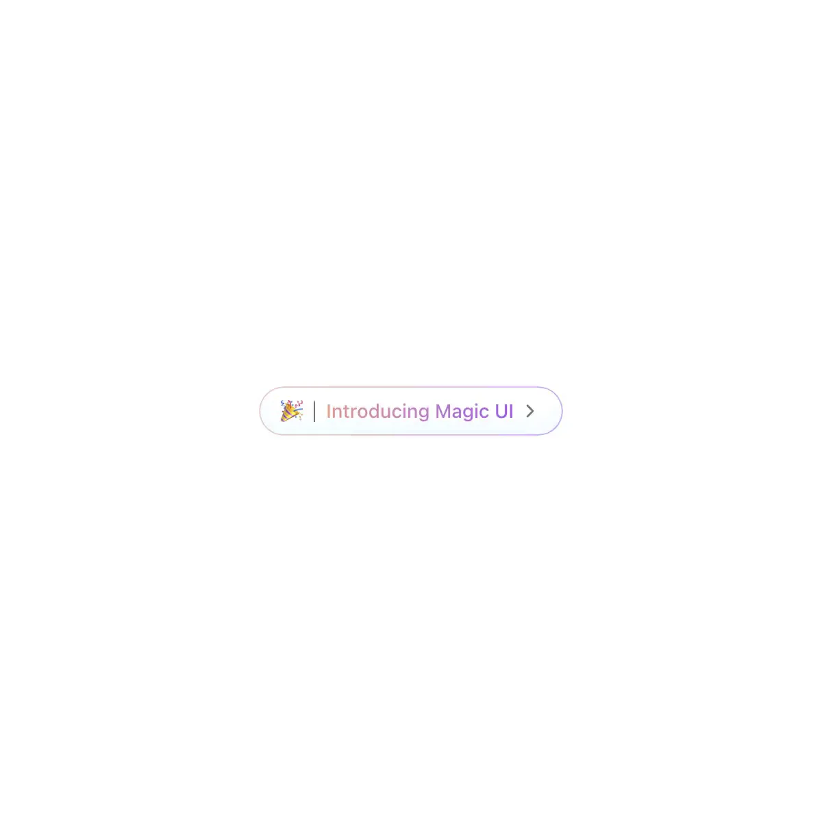
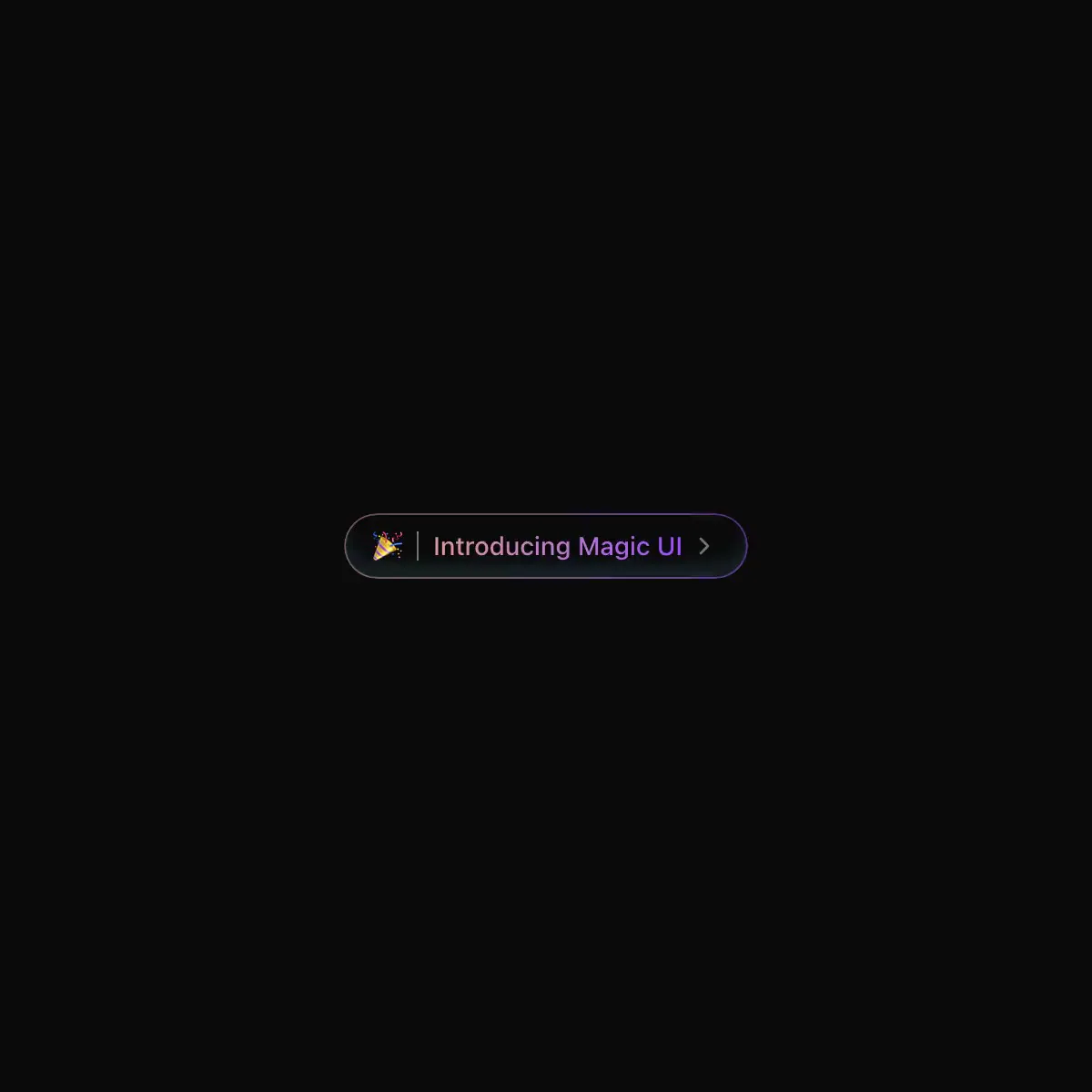 Animated Gradient Text from @magicui
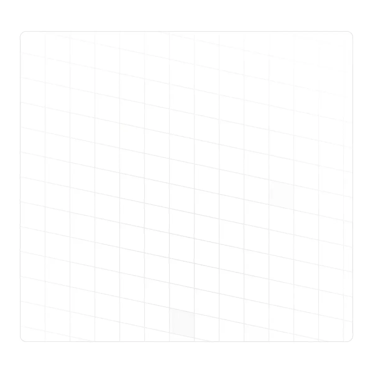
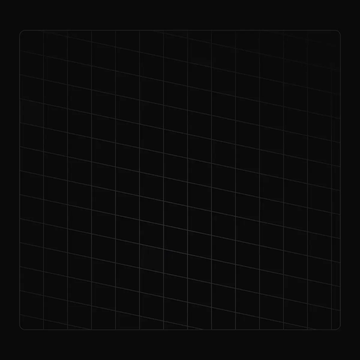 Animated Grid Pattern from @magicui
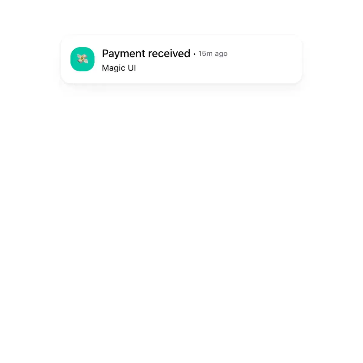
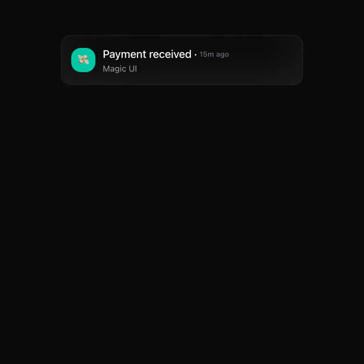 Animated List from @magicui
 Animated Shiny Text from @magicui
 Theme Toggler from @magicui

 Aurora Text from @magicui
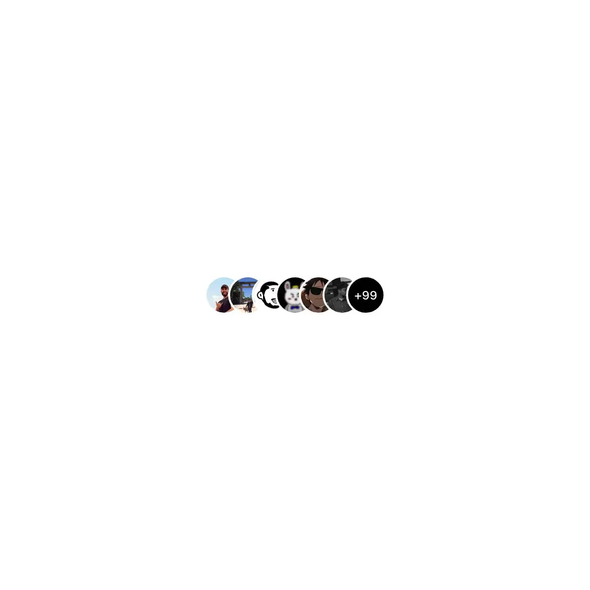
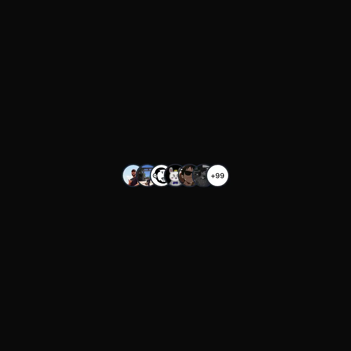 Avatar Circles from @magicui
 Backlight from @magicui
Bento grid is a layout used to showcase the features of a product in a simple and elegant way.

 Blur Fade from @magicui