@shadcn-dashboard
Circle blob expands from bottom center on hover to fill the button
Buttons and actions1 registry dep
Circle blob expands from bottom center on hover to fill the button
Animated promo code copy button with blur transition and progress fill
Showing 121–144 of 560
Interactive Hover button
A glass pill with a beam travelling along its lower edge. The chip under it is deliberately quiet, one tinted plate and a hairline border with the ink coming up to full under the cursor, because a louder face would compete with the light rather than carry it. The plate, the border and the top sheen are tokens, and the beam is told to follow the host theme with them, so the pill reads on a white page and on a black one without a second set of colours. Four palettes, the shadcn size scale with the padding opened a step for the round corners, and the beam takes a switch so the still version is the same chip with the light off. Renders an anchor when handed an href, a button otherwise.
Primary, secondary, ghost and destructive buttons with icons, sizes and a shimmering loading state
Displays a button or a component that looks like a button.
Usage example (demo) for Button: the code behind the preview on https://facadeui.dev/components/button. Installs the items it uses.
Displays a button or a component that looks like a button.
Displays a button or a component that looks like a button.
Displays a button or a component that looks like a button.
Groups multiple 8-bit buttons together inside a shared retro pixelated border.
A shadcn-style button group component built with Ark UI primitives.
A container that groups related buttons together with consistent styling.
A container that groups related buttons together with shared styling.
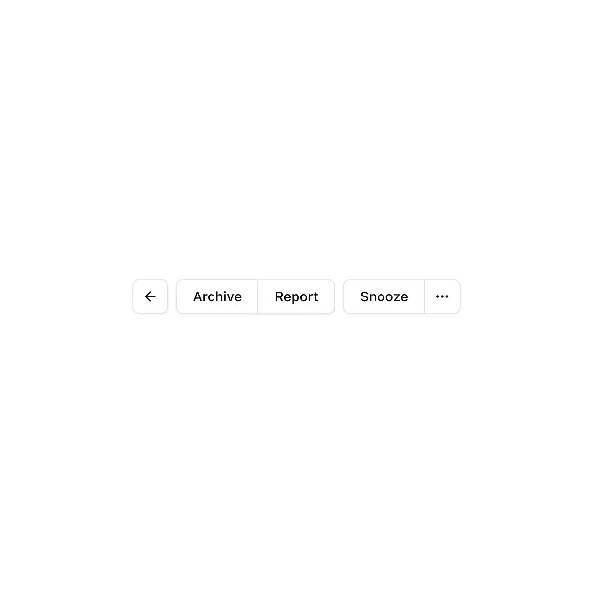
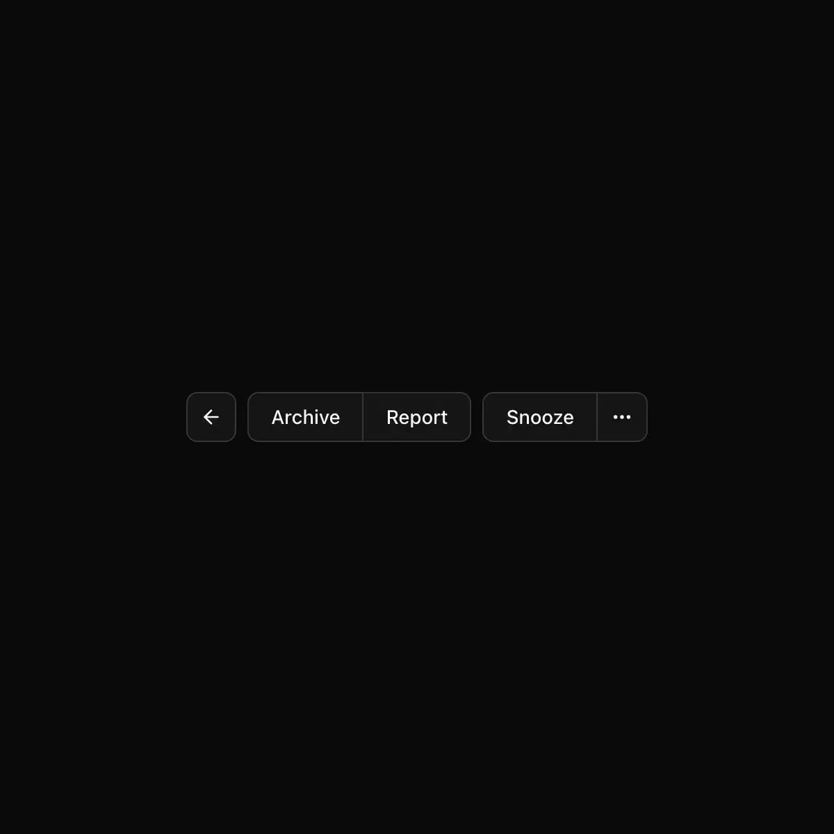
Visually joins a row or column of buttons into one bordered unit
The BRUT/UI Button Group component with the current shadcn behavior and API.
A toolbar of related tools in one raised shell; toggled tools sink into it.
Joins buttons, inputs and text into one control, across or down.
CoreCN Button Group primitive built on shadcn/ui.
A container that groups related buttons together with consistent styling.
A button-group component.
Buttons and fields joined into one control, like the + and − buttons under a list.
A container that groups related buttons together with consistent styling.