@audiocn-solid
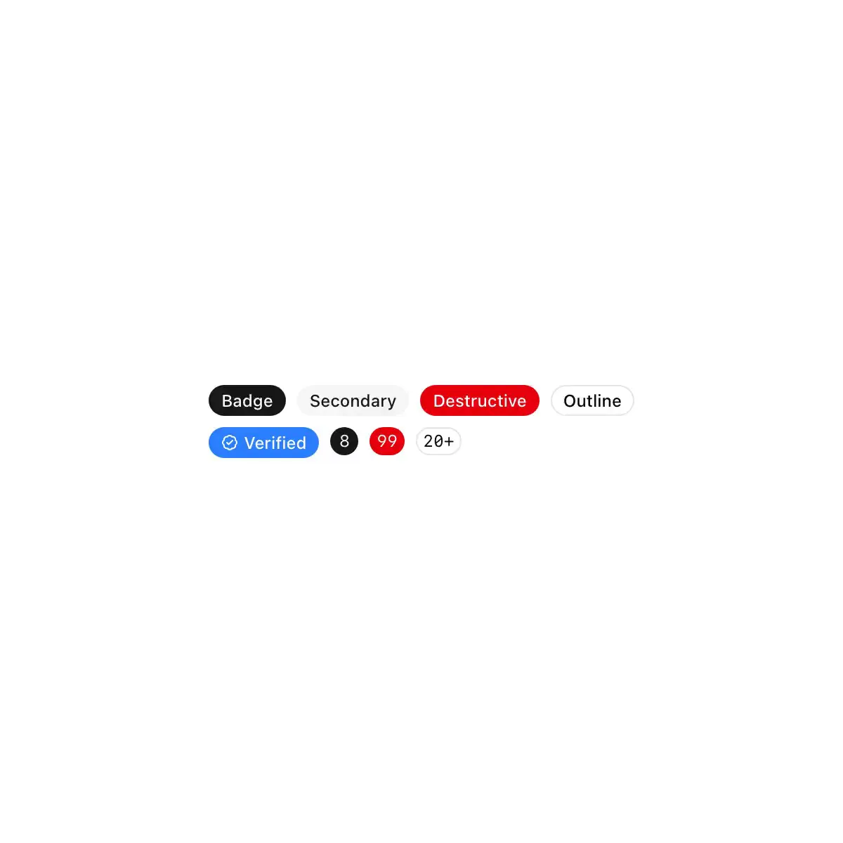
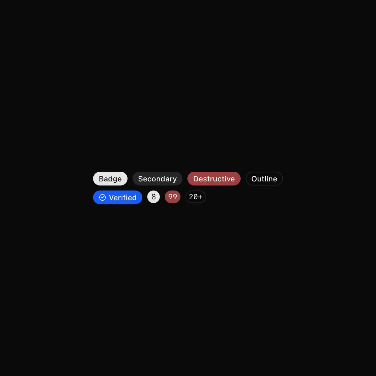
A compact status badge with default, secondary, destructive, outline, ghost, and link variants.
Data displaySolid · 1 registry dep · 2 packages
A compact status badge with default, secondary, destructive, outline, ghost, and link variants.
 badge from shadcn
Showing 169–192 of 1,272
Displays a badge or a component that looks like a badge.
A badge is a small label that can be used to display information or status.
A small printed plate with an indicator lamp, for status in tables, lists and headings. Five tones; a lamp is lit while its condition holds and dark when it doesn't. Lamps burn steady and never blink.
A small status indicator for labelling and categorising items.
Displays a badge or a component that looks like a badge with neubrutalism styling
A compact uppercase status marker.
A small label in the button's five variants, with icons, a spinner or a link.
CoreCN Badge primitive built on shadcn/ui.
Short status or metadata label. Solid, secondary and outline styles, plus success, warning and destructive statuses shown as a coloured dot.
Displays a badge or a component that looks like a badge.
A status as tone, icon and word.
A badge component.
A small capsule: an accent label, a grey count or the red badge of a Dock icon.
Displays a badge or a component that looks like a badge.
Small status pill in five colors, with a crossfade for when its variant changes.
Embossed label-maker tape.
A compact label for status, metadata, and categorization.
A small label for a status or category. You can add a prefix that only screen readers announce.
A short label for status, category or count.
Fluent 2-styled badge with shadcn APIs. Six variants (default, secondary, destructive, outline, success, warning) as a compact pill, with icon support and asChild support.