@blode
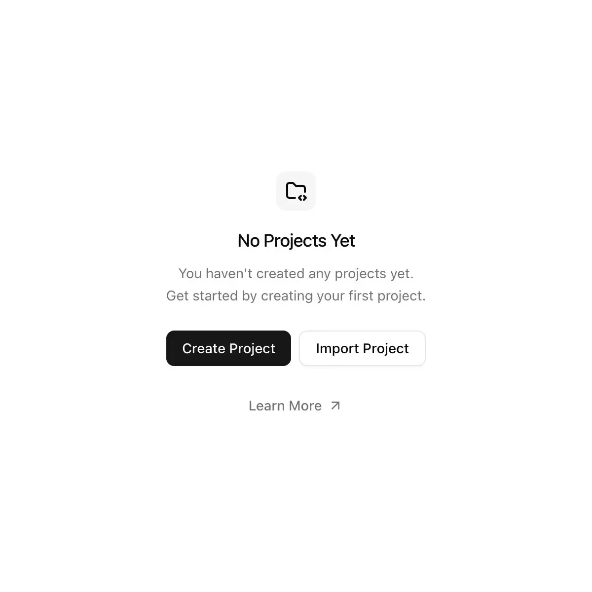
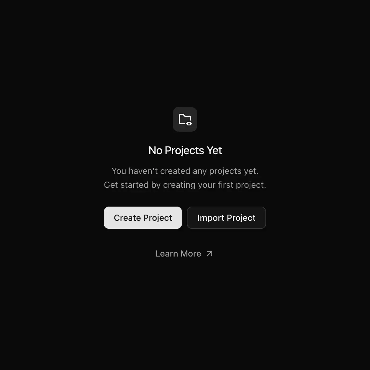
A placeholder displayed when there is no content or data to show.
Feedback
A placeholder displayed when there is no content or data to show.
The BRUT/UI Empty component with the current shadcn behavior and API.
Showing 193–216 of 886
An empty state with media, a title, a description and actions.
CoreCN Empty primitive built on shadcn/ui.
Displays an empty state, with media, a title, a description, and actions.
The empty state of a list or pane: a large grey symbol, a title and a hint.
Use the Empty component to display an empty state.
The state of a list with nothing in it: an icon, a title, one sentence and the next action. Dashed or plain, three sizes.
Displays an empty state with optional illustration, title, and description.
Displays an empty state with a title, description, and optional actions.
Displays an empty state with media, title, description, and actions.
A placeholder state for screens with no data yet, combining an icon, a title, a description, and follow-up actions.
Displays an empty state.
Empty state primitives for Tile UI.
Empty state with a pixel icon, title, description and actions.
Empty-cart art: a shopping bag slumps and sighs, perks up when a price tag dangles in, and puffs up proudly with a bounce when you add something.
A banner component with optional code display for UI blocks.
Placeholder section for custom content
An Empty Result component for displaying an empty state.