@gc-solid
Forms
Text field on a sunken well in three sizes with a volt focus halo, leading icon, joined text, select and button add-ons, a help tooltip, a clear button and a single shake when an error appears.
Displays a form input field with optional glassy variant.
Input — gymnopédies-themed shadcn primitive.
A styled Base UI text input with size variants.
A single-line text field: a well with the control edge as an inset ring, and the focus wake.
Single-line text input styled with the theme's inset field surface.
Text field with sizes, validation states, leading icon and clear button.
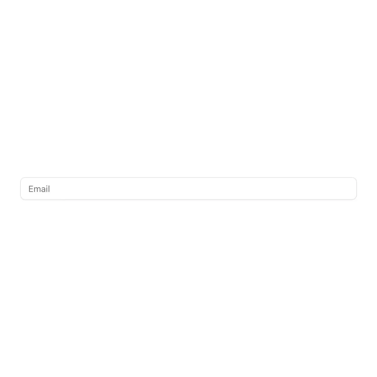
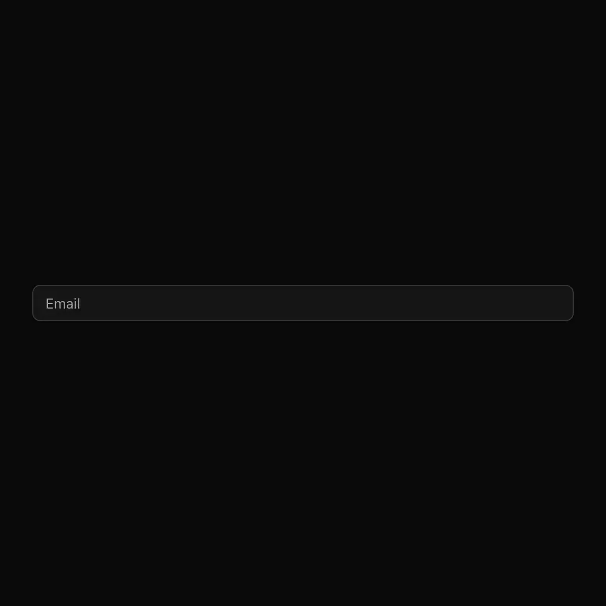 input from shadcn
Displays a form input field.
ورودی
The focus ring closes in around the field on a spring.
Input with sizes, prefix/suffix, shortcut and password reveal; InputGroup; Textarea with counter and auto-grow; Field with label, hint, error, required and help.
The bare text input Field and TextField build on.
A styled text field for collecting short-form user input.
Accessible text input primitive (Base UI).
An inset neumorphic text input with accessible focus and error states.
Displays a form input field or a component that looks like an input.
A text input on a glass surface that raises a highlight ring on focus and dims when disabled.
A single line to type into, with icons, units and buttons set inside its box.
A styled text input built on Base UI.
Single-line text input.
Showing 721–744 of 2,114
Showing 721–744 of 2,114


















