@sevenui
Displays a toggle group built on the Base UI Toggle Group primitive.
Forms2 registry deps · 3 packages
Displays a toggle group built on the Base UI Toggle Group primitive.
Toggle Group is exclusive segmented selection (radiogroup) with joined chrome — Segmented Control is this presentation, not a separate component.
Showing 2,065–2,088 of 2,114
A set of toggles, single or multiple (Radix).
Grouped toggle buttons for Tile UI.
A row of pixel toggles for one or many choices.
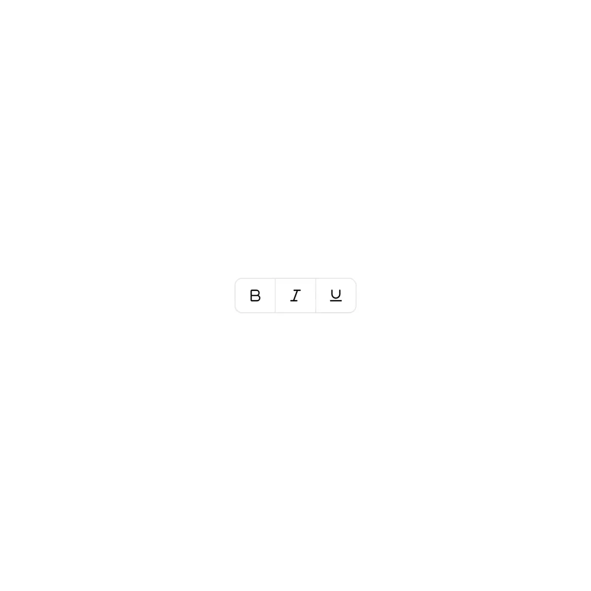
A row of icon or text toggles, single or multiple: one pressed fill glides between options, or each fades in on its own and neighbours join, as in a formatting toolbar.
Segmented tile control for one-of-n choices, such as a light / dark / system theme picker.
Single and multiple selection toggle groups in default and outline variants, attached and spaced, small and large, and vertical.
Grid, list, and board view switcher that always keeps one view selected and re-lays out a project list.
Multiple selection weekday picker for recurring schedules with round day toggles, presets, and a readable summary like Every weekday.
Analytics card with a 24h, 7d, 30d, and 90d time range toggle that updates the total, trend, and bar chart.
Product variant picker with color swatch and size toggle groups, sold out sizes, low stock messages, and an add to cart button.
A row of toggle buttons – several on at once or one that can be cleared, labels or icons, a tray or separate chips, one tab stop with arrow keys
An everyday on/off switch, as a bat-handle toggle on a small plate. The lever swings through its bushing toward the side that's on and settles with a little spring; a lamp at the end of the plate lights. For settings rows. (For banks of config bits use DIP switches; for dangerous actions, the guarded switch.)
Feature section with an on/off switch that reveals its settings when on.
A switch whose knob rides a spring and stretches with its own speed.
整条可点的开关,打开时铺上淡色、圆形手柄滑到右端,与数值滑块同一套高度。
Expandable vault component with animated open/close, trigger button, and content panel.
Tokens pop into the field as you add them, and the remove buttons press in.
方条左侧标签、右侧一排色点的单选组,色点取主题变量,跟随亮暗与颜色主题。
Switches for the tools a model may use — web search, code execution, file access — with unmistakable on and off states.
Every call of a run on one time axis: nested by caller, live bars, inline input/output/error, filters, search, brush zoom, critical path and virtualised rows.
3D drum picker — rows ride a perspective cylinder, flick to spin with momentum that lands on a detent, the centred row lit between accent rule lines. Drag, touch, wheel notches, tap-a-row and full keyboard (arrows, PageUp/Down, Home/End, type-ahead). Listbox or spinbutton semantics; TumblerGroup shares one band across drums for time and date pickers. Flat list under reduced motion.