@ark-cn
A shadcn-style collapsible component built with Ark UI primitives.
Layout1 package
A shadcn-style collapsible component built with Ark UI primitives.
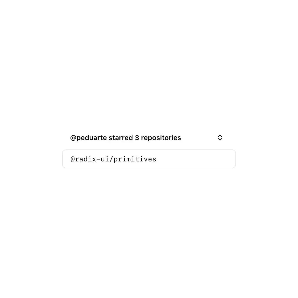
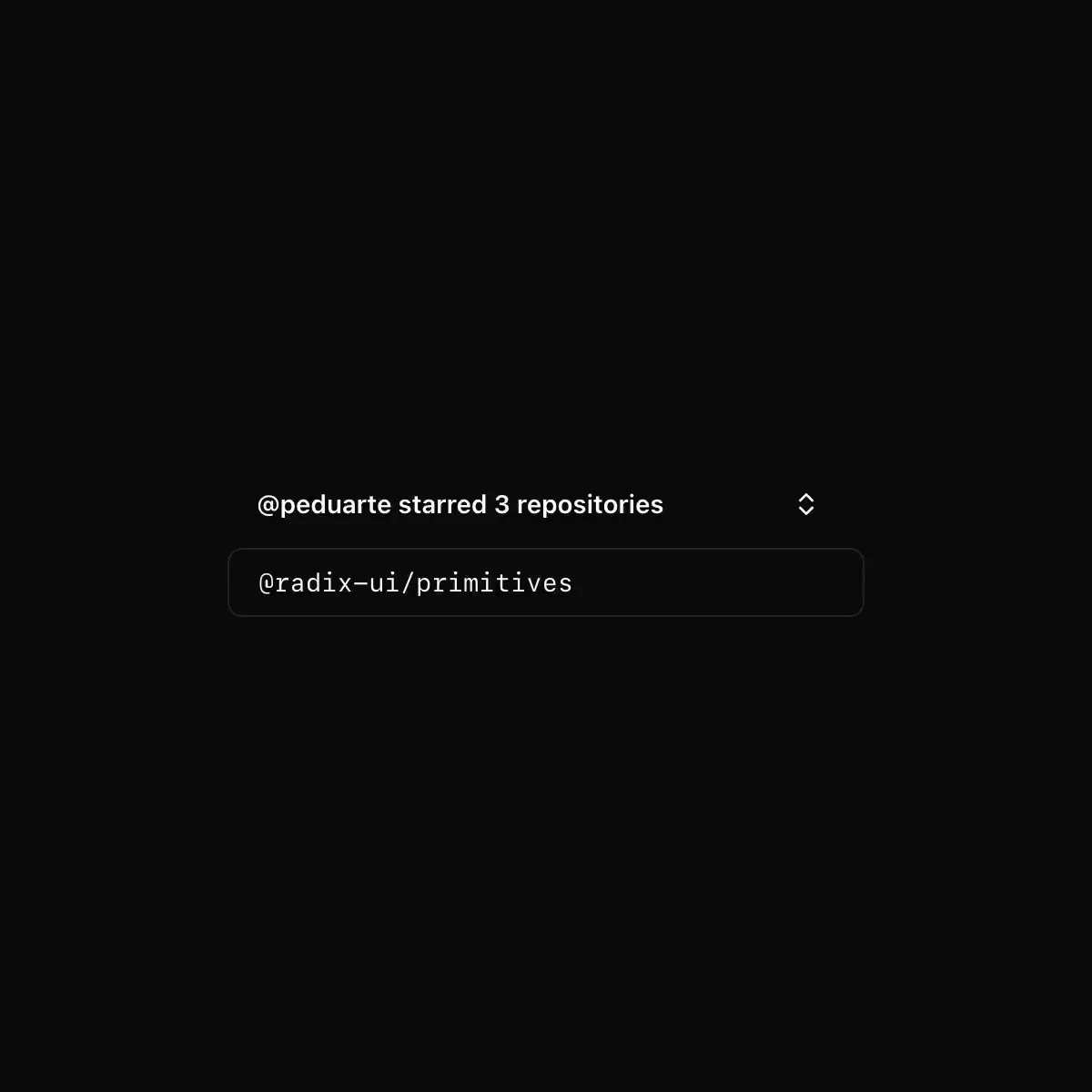
Single disclosure with height:auto settle and chevron rotate.
Showing 289–312 of 816
An interactive component which expands/collapses a panel.
An interactive component that expands and collapses a panel of content.
An interactive component which expands/collapses a panel
The BRUT/UI Collapsible component with the current shadcn behavior and API.
Used to hide and show content with a smooth animation.
Collapsible layout field for BuzzForm v2.
A section that opens and closes by animating its height.
A section that opens and closes, growing to its height.
CoreCN Collapsible primitive built on shadcn/ui.
A region that a trigger button shows and hides, with a height animation.
An interactive component which expands and collapses a panel.
A collapsible component.
A section that shows and hides its content with a height animation.
An interactive component which expands and collapses a panel.
A disclosure primitive for expandable content.
An interactive component which expands/collapses a panel.
Collapsible — gymnopédies-themed shadcn primitive.