@tailwind-admin
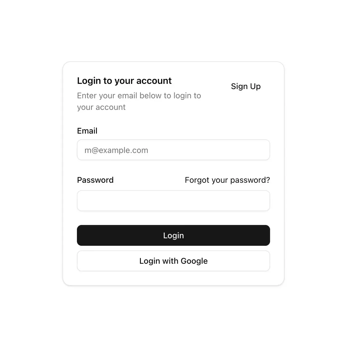
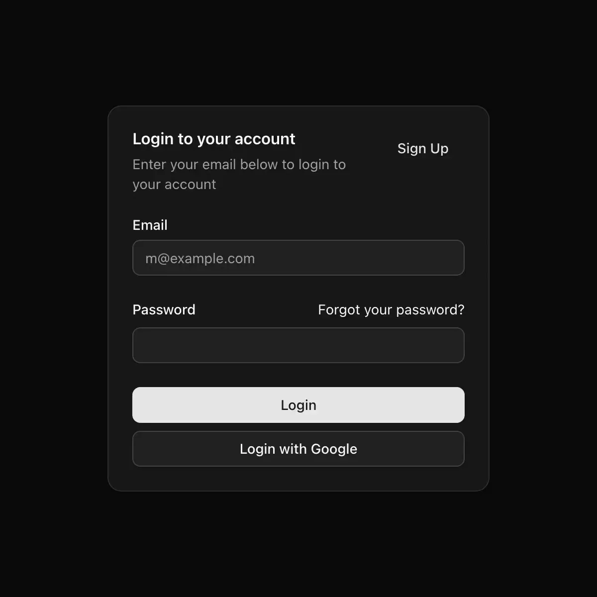
A Card component with optional code display for UI blocks.
Layout2 registry deps · 2 packages
A Card component with optional code display for UI blocks.
Byline-first card with a pull quote, a bookmark that pops and ticks its count, and a copy-link action.
Showing 145–168 of 816
Cover card with a drawn type specimen whose layers drift under the pointer, plus category, excerpt and byline.
Split card for a multi-part series: step through parts while the art and copy crossfade in the direction of travel.
A grid of article cards with date, tag and summary.
A beam of light with a tail, a bright head and a halo that travels around the outline of any content at constant speed.
A panel with twin comets orbiting a 2px border ring built from a rotating conic gradient cut by a two-layer CSS alpha mask (never an SVG luminance mask). The angular velocity itself is sprung (k=30, d=11), winding to 240 deg/s on hover and coasting back to 42 deg/s, with an optional coral signature comet 180 degrees opposed. One custom property per frame; content never repaints.
A fanned hand of cards that bounces in, then lifts a card and pushes its neighbors aside on hover or focus.
A browser window mockup for showing a dashboard or web app on a landing page, in Chrome or Safari frames, with a phone layout under 480px.
A bento tile whose picture is a tightly cropped loop of your product, still until someone hovers or presses play, with a hairline that tracks the loop.
A simple 8-bit card component
The card every screen is built from – header with title, quiet line and an action, content and a footer, the whole card a click target and a gray fill when selected
A panel with a colored left edge, or `accent={false}` for none. With a `CardLink`, the edge traces the card on hover.
A flexible container for grouping related content and actions.
Elevated surface with header, content, and footer slots.
Displays a card with header, content, and footer.
Displays a card with header, content, and footer.
A container for grouping related content and actions.
Displays a card with header, content, and footer with thick borders and shadows
A weighted panel with stronger elevation than controls.
A bordered surface that groups related content, with a header, content and footer.