@velora
Perspective card that turns toward the pointer while its layers lift to different depths.
Layout1 registry dep · 1 package
Perspective card that turns toward the pointer while its layers lift to different depths.
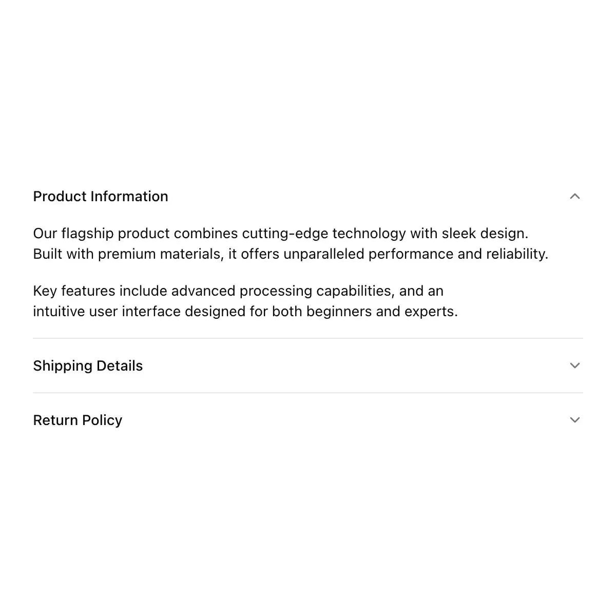
 accordion from shadcn
Showing 1–24 of 461
Sections that open one at a time or many. The marker is a plus that rotates into a minus.
A shadcn-style accordion component built with Ark UI primitives.
Disclosure with height:auto, chevron rotate, and optional focus morph.
A set of collapsible panels with headings.
An accordion allows users to toggle the display of sections of content. Each accordion consists of a header with a title and content area.
A vertically stacked set of interactive headings that reveal or hide associated content.
A vertically stacked set of interactive headings with neubrutalism styling
The BRUT/UI Accordion component with the current shadcn behavior and API.
CoreCN Accordion primitive built on shadcn/ui.
Stacked sections that open and close under their headings, one or several at a time, with a height animation.
A accordion component.
Disclosure sections like Finder's Get Info window, with triangles that turn as they open.
A vertically stacked set of interactive headings that each reveal a section of content.
Index-card dividers that open to reveal their notes.
A vertically stacked set of expandable content panels.
Fluent 2-styled accordion (expand/collapse groups) with a shadcn API. Built on @base-ui/react's Accordion for open/close state and a height-animated collapsible panel; the trigger rotates a ChevronDownRegular chevron and the panel animates height via Base UI's --accordion-panel-height CSS variable.
Collapsible accordion with animated height transitions, spring-animated chevron, and fluid hover in grouped mode. Built on Radix UI Accordion.
Single-open accordion whose panels open on a weighted height spring while the body rises out of a blur and the plus turns into a cross.
Accordion — gymnopédies-themed shadcn primitive.