زبانهها با الگوی Tabs در WAI-ARIA؛ کلیدهای جهتدار در راستبهچپ برعکس عمل میکنند
Navigation2 registry deps
زبانهها با الگوی Tabs در WAI-ARIA؛ کلیدهای جهتدار در راستبهچپ برعکس عمل میکنند
The key stretches across the list to the tab you pick, and the panel slides in from that side.
Showing 865–888 of 945
Tabs in underline, pill and button styles, horizontal or vertical, with icons, counts, overflow scrolling and a sliding indicator.
Tabs and a floating tab bar with a lens you can drag.
Primary and secondary tabs with the sliding active indicator.
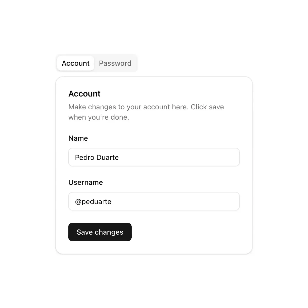
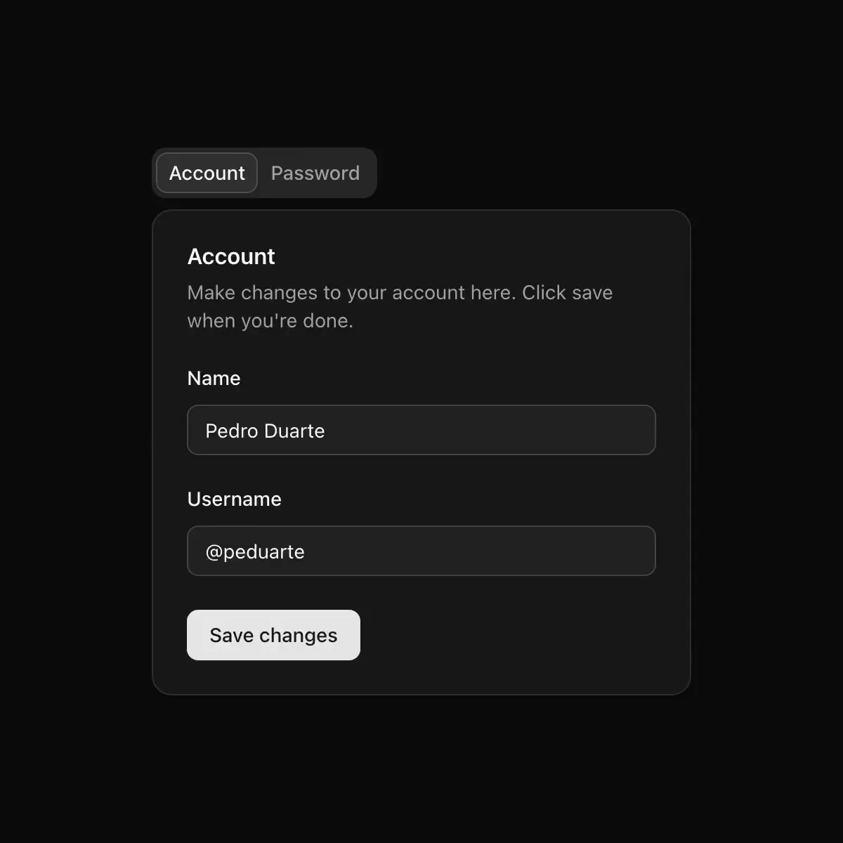
A tabbed interface for switching between related content panels.
Accessible tab navigation primitive (Base UI).
Keyboard-accessible tabs with raised active controls and inset lists.
A set of layered sections of content—known as tab panels.
Radix tabs on a glass list, with a pane indicator that animates between triggers.
A few views of one thing, one at a time, chosen from a row of tabs whose marker slides to the one chosen.
An accessible, animated tabs component built on Base UI with a spring-animated sliding active-tab indicator.
Tabbed views with pill, underline and segment list styles and a travelling indicator, built on Radix.
Capsule pill tabs with pastel active tab highlights.
Pestañas sobre Base UI, con indicador deslizante.
Tabs component built on Base UI, styled with sc1m tokens.
A set of layered sections of content — known as tab panels — that display one panel at a time, built on the Base UI Tabs primitive.
Tabs is a navigation pattern that switches between related in-context views using tablist/tab/tabpanel semantics and roving focus.
A set of layered panels where selecting a tab in the list shows its panel and hides the others.
Condensed uppercase labels with a heavy accent bar that slides between tabs.
Tabs with a sliding active indicator (Radix + Motion).
Tabs navigation primitives for Tile UI.