


















@ai2
Badge with a variant x tone x size matrix: 3 variants (solid, soft, outline), 6 tones, 3 sizes (sm, md, lg). Icons work with both lucide svg and remixicon i children. Supports asChild for links.
2 registry deps · 2 packages
Badge with a variant x tone x size matrix: 3 variants (solid, soft, outline), 6 tones, 3 sizes (sm, md, lg). Icons work with both lucide svg and remixicon i children. Supports asChild for links.
Compact label for status, metadata, and counts.
A shadcn-style badge component built with Ark UI primitives.
Small label for status, categories, and metadata.
A compact status badge with default, secondary, destructive, outline, ghost, and link variants.
A badge component for displaying status or labels.
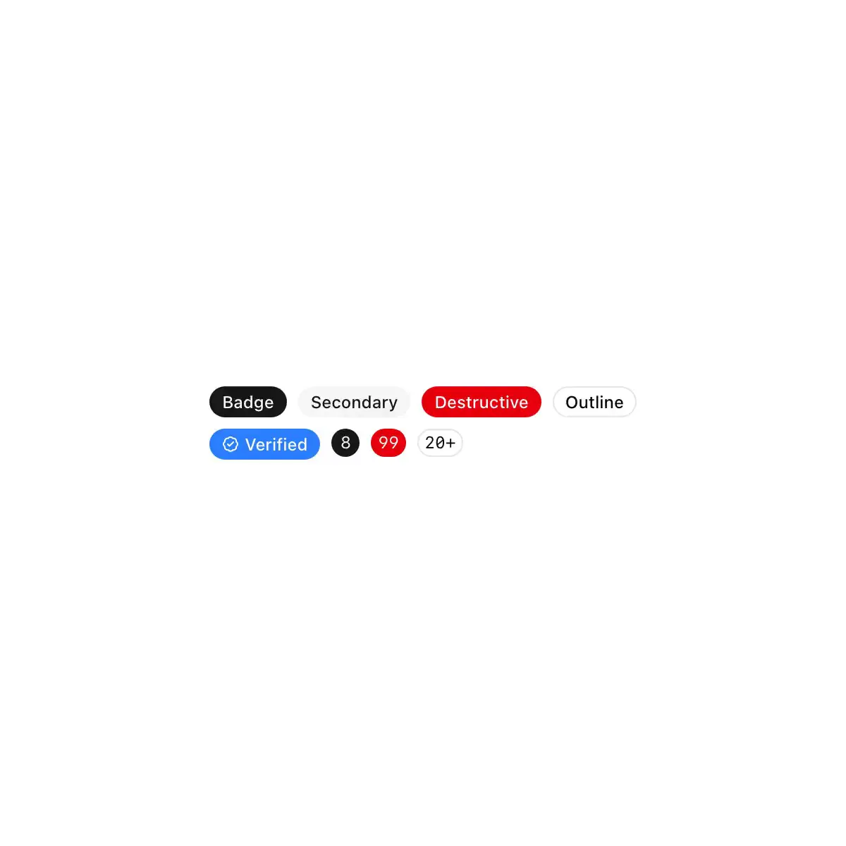
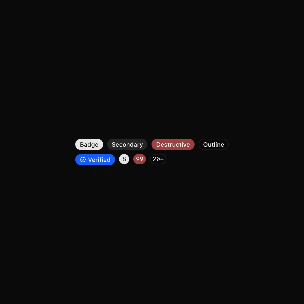 badge from shadcn
Displays a badge or a component that looks like a badge.
A badge is a small label that can be used to display information or status.
A small printed plate with an indicator lamp, for status in tables, lists and headings. Five tones; a lamp is lit while its condition holds and dark when it doesn't. Lamps burn steady and never blink.
A small status indicator for labelling and categorising items.
Displays a badge or a component that looks like a badge with neubrutalism styling
Orange or dark pixel badge.
A compact uppercase status marker.
A small label for status, category or count.
A small label in the button's five variants, with icons, a spinner or a link.
CoreCN Badge primitive built on shadcn/ui.
Short status or metadata label. Solid, secondary and outline styles, plus success, warning and destructive statuses shown as a coloured dot.
A status as tone, icon and word.
A badge component.
Compact status and category labels with status dots and a mono style.
A small capsule: an accent label, a grey count or the red badge of a Dock icon.
Showing 2,401–2,424 of 29,980
Showing 2,401–2,424 of 29,980