


















@iconaut
Iconaut shield-user icon, line, with native fits at 16/20/24px. MIT.
Iconaut shield-user icon, line, with native fits at 16/20/24px. MIT.
Iconaut shield-user icon, duotone, with native fits at 16/20/24px. MIT.
Iconaut shield-user icon, solid, with native fits at 16/20/24px. MIT.
Iconaut shield-x icon, line, with native fits at 16/20/24px. MIT.
Iconaut shield-x icon, duotone, with native fits at 16/20/24px. MIT.
Iconaut shield-x icon, solid, with native fits at 16/20/24px. MIT.
A call-to-action button that trades its leading icon for a directional cue.
Card component with shift animation effects and hover interactions
Text with a band of light sweeping across it, for loading and thinking states.
A slow sweep of light across text still being worked on.
A sweeping light gradient shimmer animation for text elements.
A band of light that passes over text while something is working. It is made from the text’s own colour, so it suits any text and anything inside it, icons included.
A button with a beam of light travelling around its border.
A pill CTA whose surface catches a sweeping band of light.
Pill button with a satin sheen: a soft band of light sweeps across the face and lifts the label, then rests; on hover the highlight follows the pointer
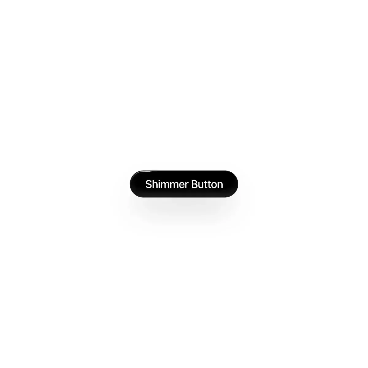
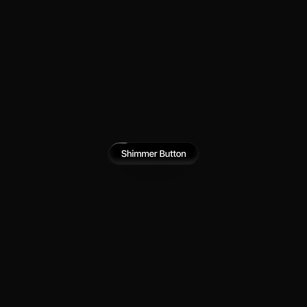 Shimmer Button from @magicui
CTA button with a continuous light sweep.
Skeleton blocks that share one soft light sweep, plus shimmering text for “Thinking…” states
Lightweight loading skeleton with a smooth shimmer sweep animation.
A ShimmerSweep text animation component for SmoothUI.
A light sweeps across the text, for work in progress.
A band of light sweeping across text now and then, paused off screen.
Shimmer text effect for React and shadcn: a band of light sweeps a loading label, in one phase shared by every shimmer on the page.
Animated shimmer text with a sweeping highlight band, adjustable spread, and configurable loop speed for emphasis-heavy copy.
Showing 24,481–24,504 of 29,980
Showing 24,481–24,504 of 29,980