Table is a native HTML table foundation with captions, headers, body rows, footers, cell alignment, responsive overflow, RTL support, print-friendly scrolling, and composition patterns for empty/loading/error — not the interactive Data Table pattern (no sorting, selection, or pagination).
Data display1 registry dep
A styled HTML table for presenting structured data in rows and columns, with header, body, footer, and caption parts and a built-in horizontal-scroll container.
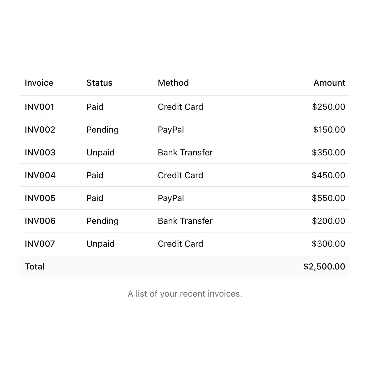
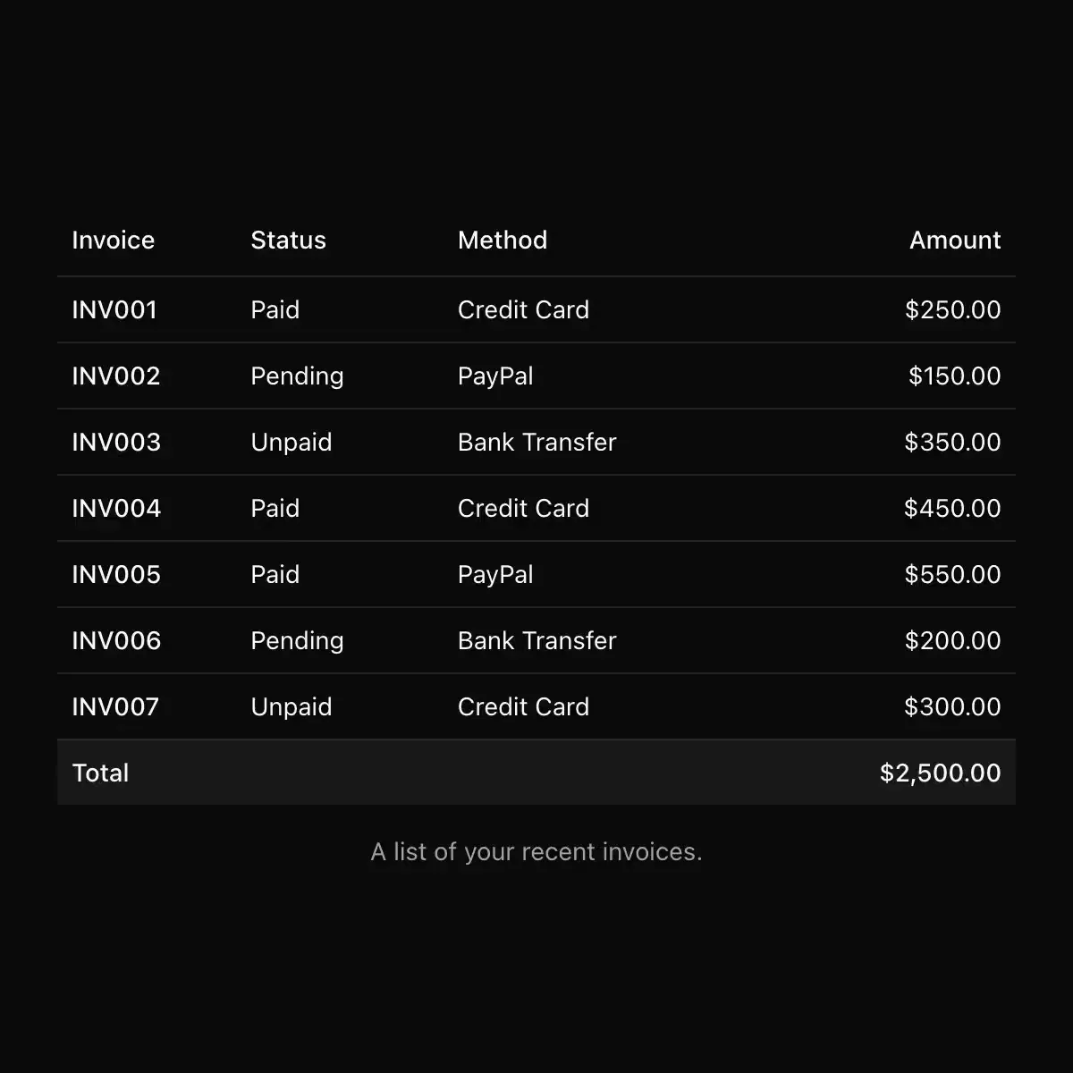 table from shadcn
A table component with multiple variants.
Composable React table primitives for Tile UI.
Data display2 registry deps
Data table with pixel rules and a font-pixel header.
Data display1 registry dep · 1 package
Table component.
A responsive table component with semantic markup and a sticky header option.
Data displayReact · 1 registry dep · 1 package
Rows are never glass , one backdrop-filter per row repaints its own backdrop region on every scroll. Surface treatment belongs on the container.
Data display1 registry dep
Design system ui component.
Table Actions variant for component.
3 registry deps · 1 package
Card shell around a table: header, body, footer, count and a bulk-action bar.
Data display7 registry deps · 1 package
Table Cells from the Get IT Done design system.
14 registry deps · 1 package
Animated table-cells icon for React
Iconaut table icon, duotone, with native fits at 16/20/24px. MIT.
A filter for one column of a Table, in its header: a funnel button that opens the column's values as Menu rows, checkboxes with how many rows each would show, or radio buckets for a number. A filtering column's button wears the selected segment.
Table Footer variant for component.
Dense ops table where rows above a heat threshold shimmer like air over asphalt: live DOM text refracts through an animated SVG displacement filter while cold rows sit dead-still behind hairline borders.
A table component with floating toolbar and border customization.
7 registry deps · 2 packages
A reading-aware page outline with an animated active marker, expandable subsections, and a progress rail.
NavigationReact · 2 packages
Table Of Contents from the Get IT Done design system.
A sticky table of contents that spies on headings while you scroll, with a marker that glides to the active item and smooth scroll on click.