@pane
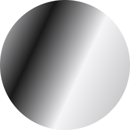
Type cut from glass: each letter blurs, saturates and, in Chromium, bends what's behind it, with light on its edge. For headlines over a photo, a video or a gradient.
Data display2 registry deps
Type cut from glass: each letter blurs, saturates and, in Chromium, bends what's behind it, with light on its edge. For headlines over a photo, a video or a gradient.
A simple typography component for consistent text styling
A lightweight wrapper around the React Native Text component to provide default styles.
Extruded, floating 3D text rendered with drei <Text3D>, colored with --primary.
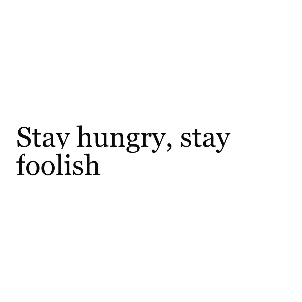
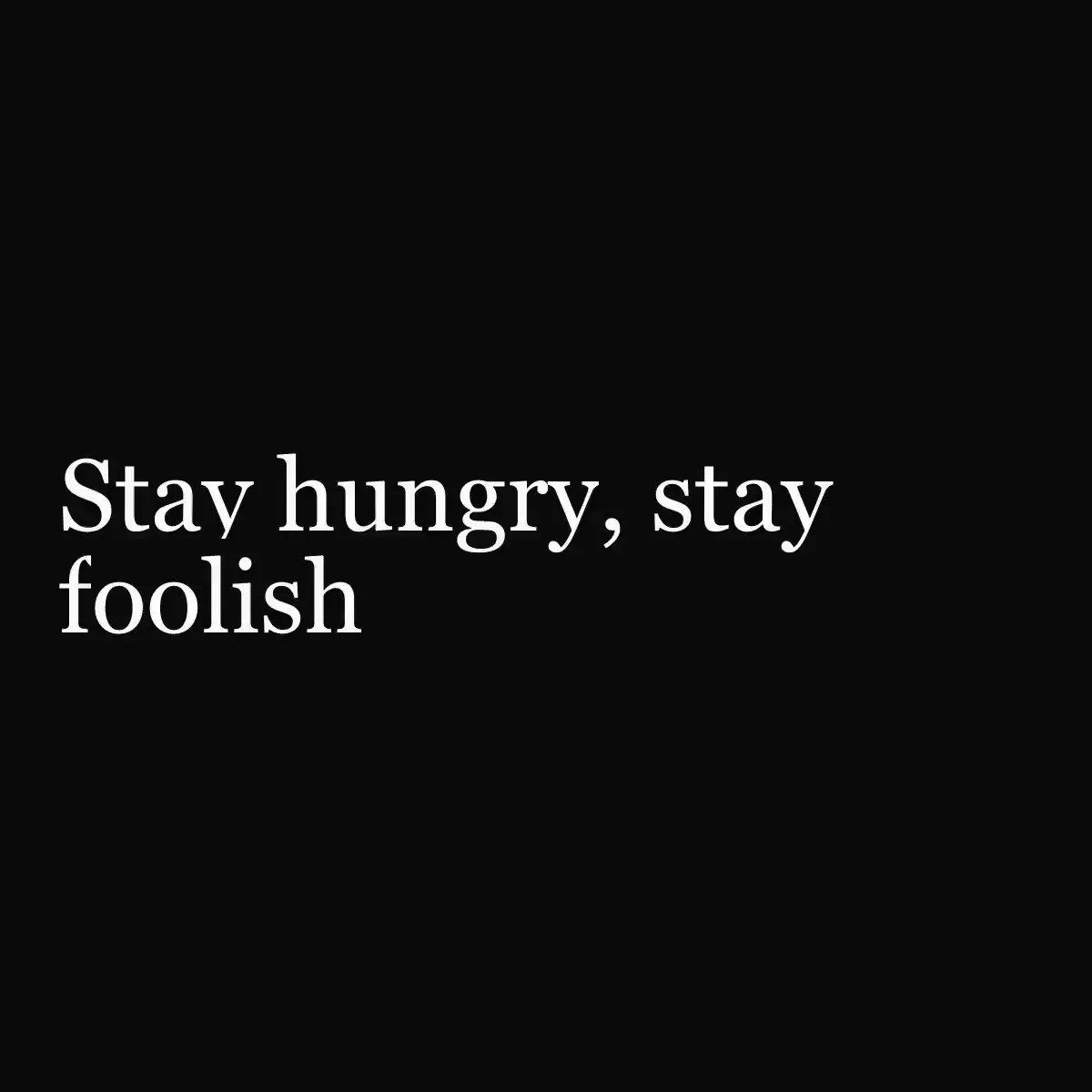 Text 3D Flip from @magicui
Hand-drawn text align center icon that draws itself in and wiggles. MIT licensed.
Hand-drawn text align end icon that draws itself in and wiggles. MIT licensed.
Hand-drawn text align start icon that draws itself in and wiggles. MIT licensed.
Text follows an SVG path, optionally animated
Animated text component with customizable reveal effects and timing
 Text Animate from @magicui
关键词轮换、分字显现、乱码解码与高亮扫过,支持中文与渐进增强。
Four text effects: a word-by-word blur reveal with a volt underline, a shimmer sweep, a glyph scramble and a rotating word swap.
Shared pieces for text animations: accessible shell, motion gate, caret.
The multi-line twin of the Text Field – grows with the text, a character count, a button for more room and ⌘ Enter to send
A multiline text input component.
The multi-line twin of the Text Field – grows with the text, a character count, a button for more room and ⌘ Enter to send
A headline that ambiently collapses character by character into a scattered field of noise glyphs below it, then climbs back into place. Hovering forces an immediate, amplified cascade.
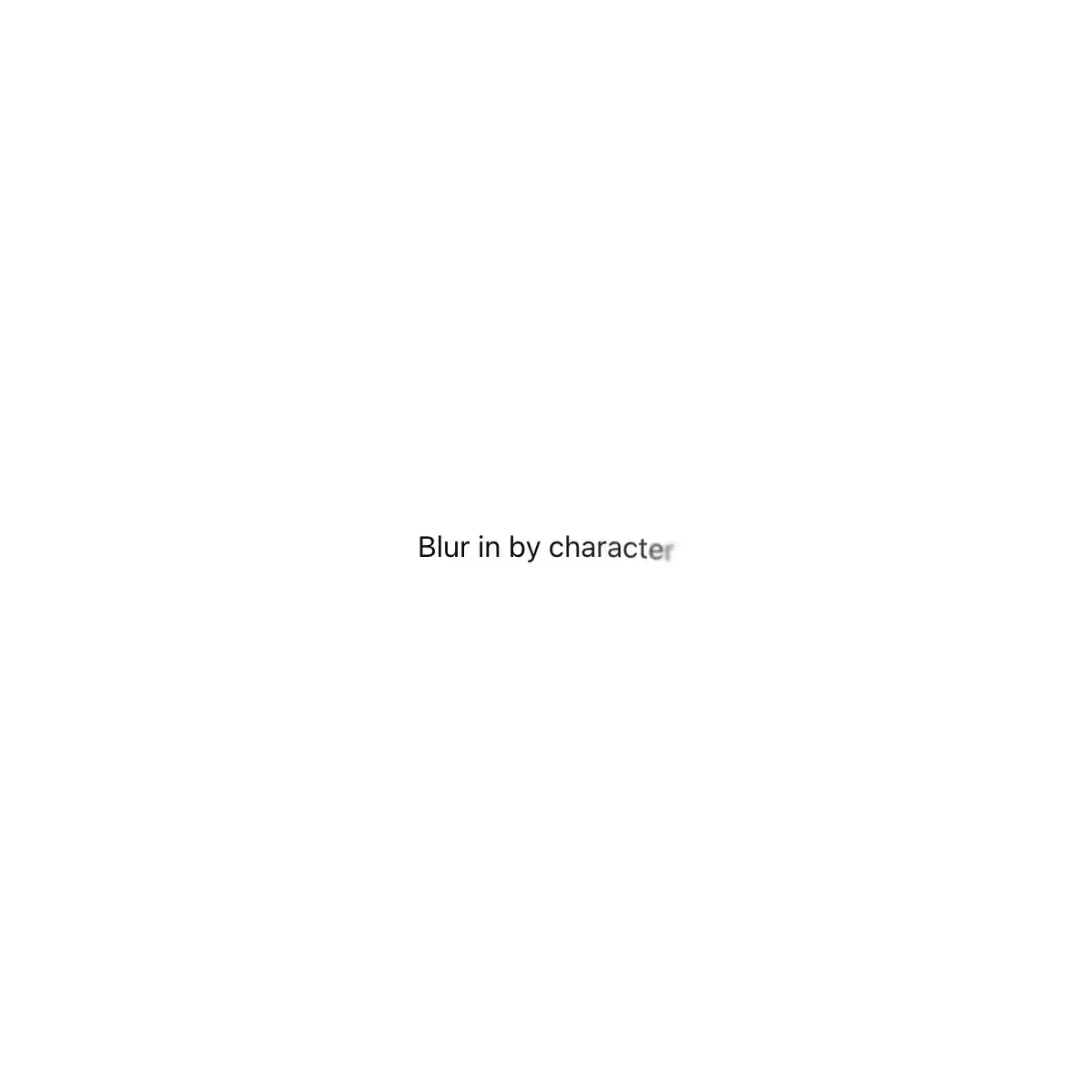
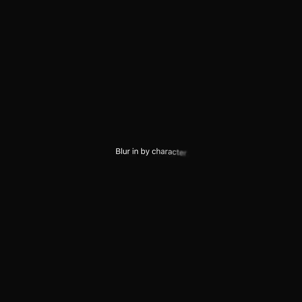
Text Blur In component.
Words animate into view one by one with a satisfying blur-to-sharp entrance, auto-replaying in a loop. Free account required to install; source is free to read.
A hover or click flourish where every letter is an index card on a spindle: the face flicks back over its top edge and out of view while a duplicate flicks up from underneath into its place, staggered across the word from a configurable origin on a numerically integrated spring.
Iconaut text-compact icon, line, with native fits at 16/20/24px. MIT.
Iconaut text-compact icon, duotone, with native fits at 16/20/24px. MIT.
Iconaut text-compact icon, solid, with native fits at 16/20/24px. MIT.
Showing 27,817–27,840 of 29,980
Showing 27,817–27,840 of 29,980