@affectui
Primary, secondary, ghost and destructive buttons with icons, sizes and a shimmering loading state
Buttons and actions
Primary, secondary, ghost and destructive buttons with icons, sizes and a shimmering loading state
Seven variants and five sizes in uppercase mono. `primary` is filled phosphor; `signal` marks urgent states.
Button with a full variant x tone x size matrix: 5 variants (solid, soft, outline, ghost, link), 6 tones (neutral, brand, success, warning, danger, info), 10 sizes (xs-xl plus square icon-xs through icon-xl for icon-only buttons), plus isLoading and asChild. Every tone is driven by ai2 semantic tokens.
Customizable button component.
A shadcn-style button component built with Ark UI primitives.
Soft-rect AtroUI button — hover lift ≤1px, press into surface, focus parity.
Solid button primitive using the same base-rhea styling as the site.
A reusable button component.
Displays a button or a component that looks like a button.
A button allows a user to perform an action, with mouse, touch, and keyboard interactions.
An interactive element that triggers an action when clicked.
Displays a button with neubrutalism styling and press-down animation
Brick button + square icon-button variant. sm/md/lg, primary/dark, left/right icon slots.
A tactile neo-brutalist button with the standard shadcn API.
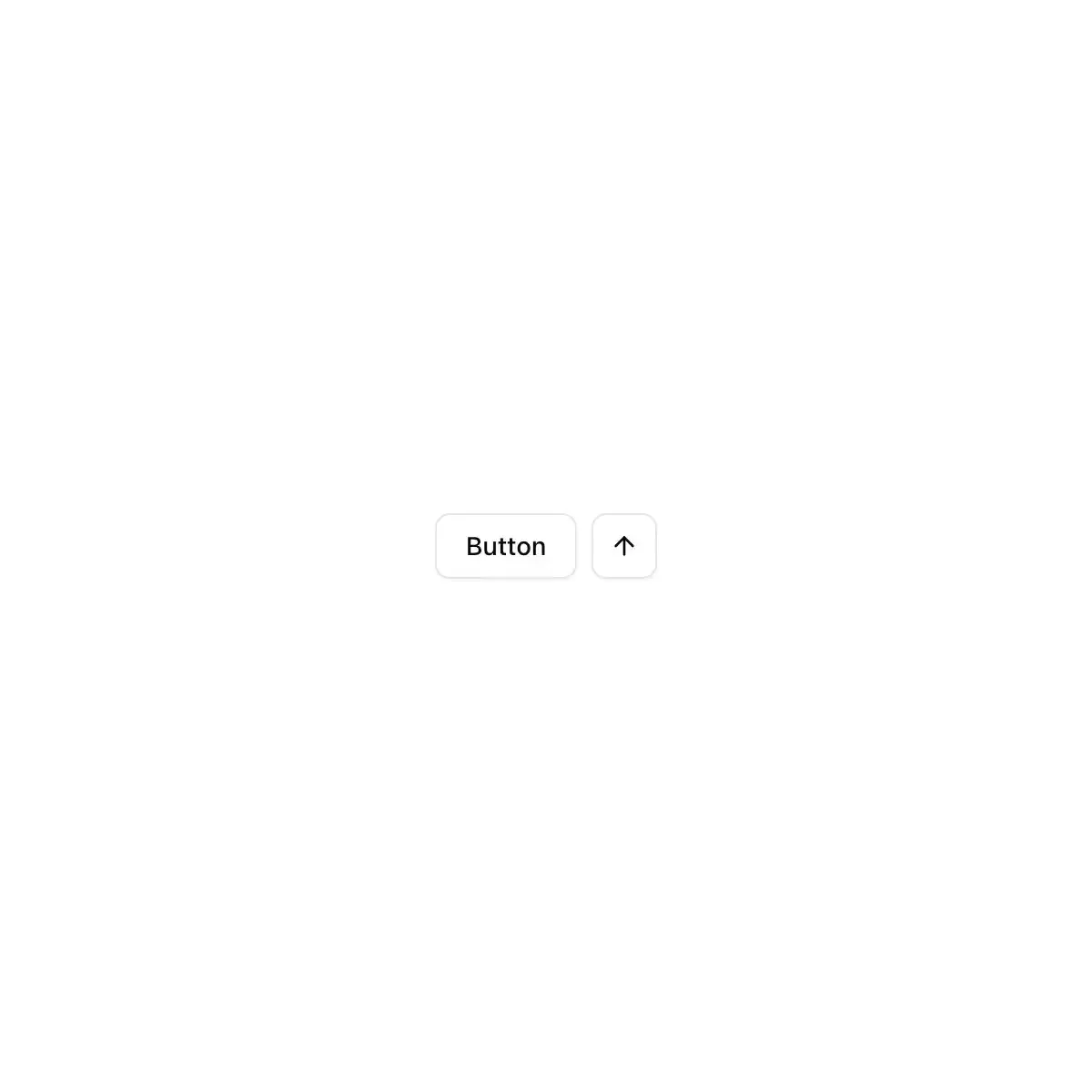
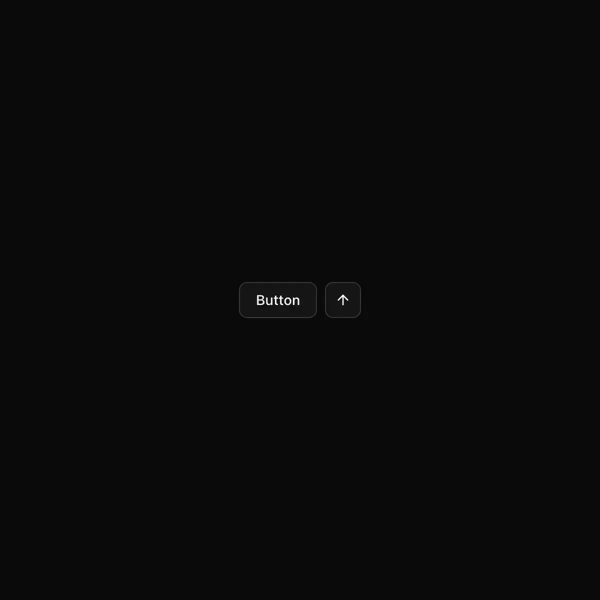 button from shadcn
A familiar action with immediate focus, a tactile press, and optional pending or label feedback that stays on the button itself.
Five variants for every level of emphasis, in four sizes, each with an icon-only square.
CoreCN Button primitive built on shadcn/ui.
Triggers an action. Variants default, secondary, outline, ghost, destructive and link; sizes sm, default, lg and three square icon sizes. Supports asChild and a loading state.
A glass capsule. Blue is for the one primary action; red text marks refusal.
A simple button component.
Tactile buttons with loading state, keyboard hints and six variants.
Showing 3,865–3,888 of 29,980
Showing 3,865–3,888 of 29,980