@ark-cn
A shadcn-style button group component built with Ark UI primitives.
Buttons and actions2 registry deps · 2 packages
A shadcn-style button group component built with Ark UI primitives.
A container that groups related buttons together with consistent styling.
A container that groups related buttons together with shared styling.
Visually joins a row or column of buttons into one bordered unit
Related buttons with shared styling.
The BRUT/UI Button Group component with the current shadcn behavior and API.
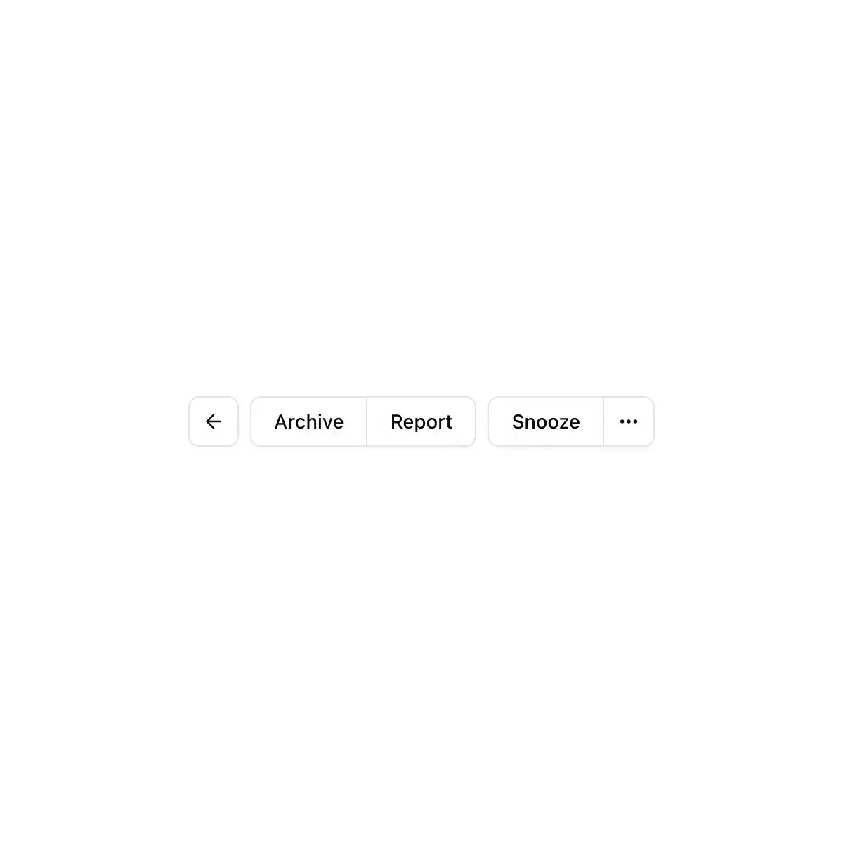
 button-group from shadcn
A toolbar of related tools in one raised shell; toggled tools sink into it.
Joins buttons, inputs and text into one control, across or down.
CoreCN Button Group primitive built on shadcn/ui.
A button-group component.
Join buttons into one control: split buttons, toolbars, steppers.
Buttons and fields joined into one control, like the + and − buttons under a list.
A container that groups related buttons together with consistent styling.
Buttons that belong together, joined into one control.
Joins a row of adjacent actions into one seamless control — one border, one divider, no doubled edges
Button Group from the Get IT Done design system.
Buttons joined into one control, with shared seams, separators, text addons, nesting and vertical stacks.
A container that groups related buttons together with consistent styling.
Showing 4,009–4,032 of 29,980
Showing 4,009–4,032 of 29,980