@iconaut
Iconaut cake icon, solid, with native fits at 16/20/24px. MIT.
Iconaut cake icon, solid, with native fits at 16/20/24px. MIT.
Animated calculate icon for Vue
Animated calculator icon for React
Animated calculator icon for Vue
Iconaut calculator icon, line, with native fits at 16/20/24px. MIT.
Animated calculator icon for Vue
Iconaut calculator icon, duotone, with native fits at 16/20/24px. MIT.
Iconaut calculator icon, solid, with native fits at 16/20/24px. MIT.
Choose one appointment day, a continuous date range, or separate days in an accessible month grid.
Calendar example: a date picker grid built on react-day-picker with button-styled navigation and single or range selection. Supports dropdown captions and week numbers.
A month drawn as time, after the "28 December" poster: a huge numeral, then a large disc for every day, ink for the days gone, the accent for today, rings for the days to come, and half-moons for the wait. The ruler draws the same month as one measured line; the ghost sets the days against the date huge and faint behind them; the parenthesis runs the month as a line of figures with the wait in parentheses.
A square month grid with phosphor selection, an amber today marker and Afterglow navigation buttons.
Date calendar on react-day-picker v10 styled with ai2 Button and tokens. Single, multiple and range selection, dropdown or label caption, outside days, week numbers. Exports Calendar, CalendarDayButton.
A calendar component for date selection.
A date field component that allows users to enter and edit date.
A calendar displays one or more date grids and allows users to select either a single date or a contiguous range of dates.
A date field component that allows users to pick dates.
A date picker calendar with neubrutalism styling
Month grid with selected day.
The BRUT/UI Calendar component with the current shadcn behavior and API.
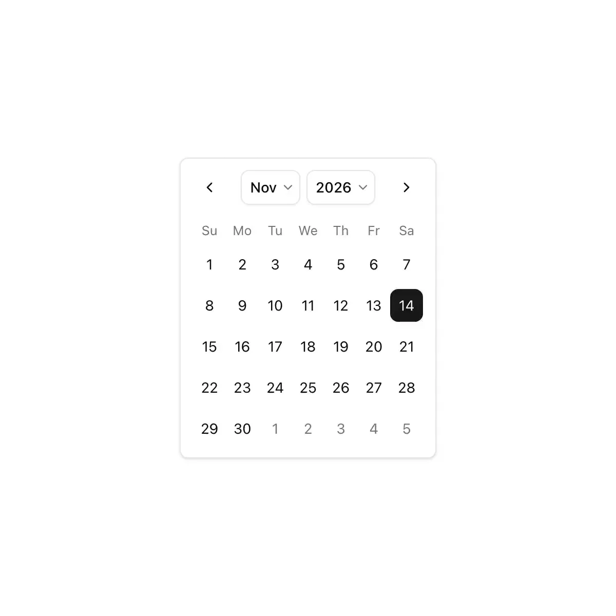
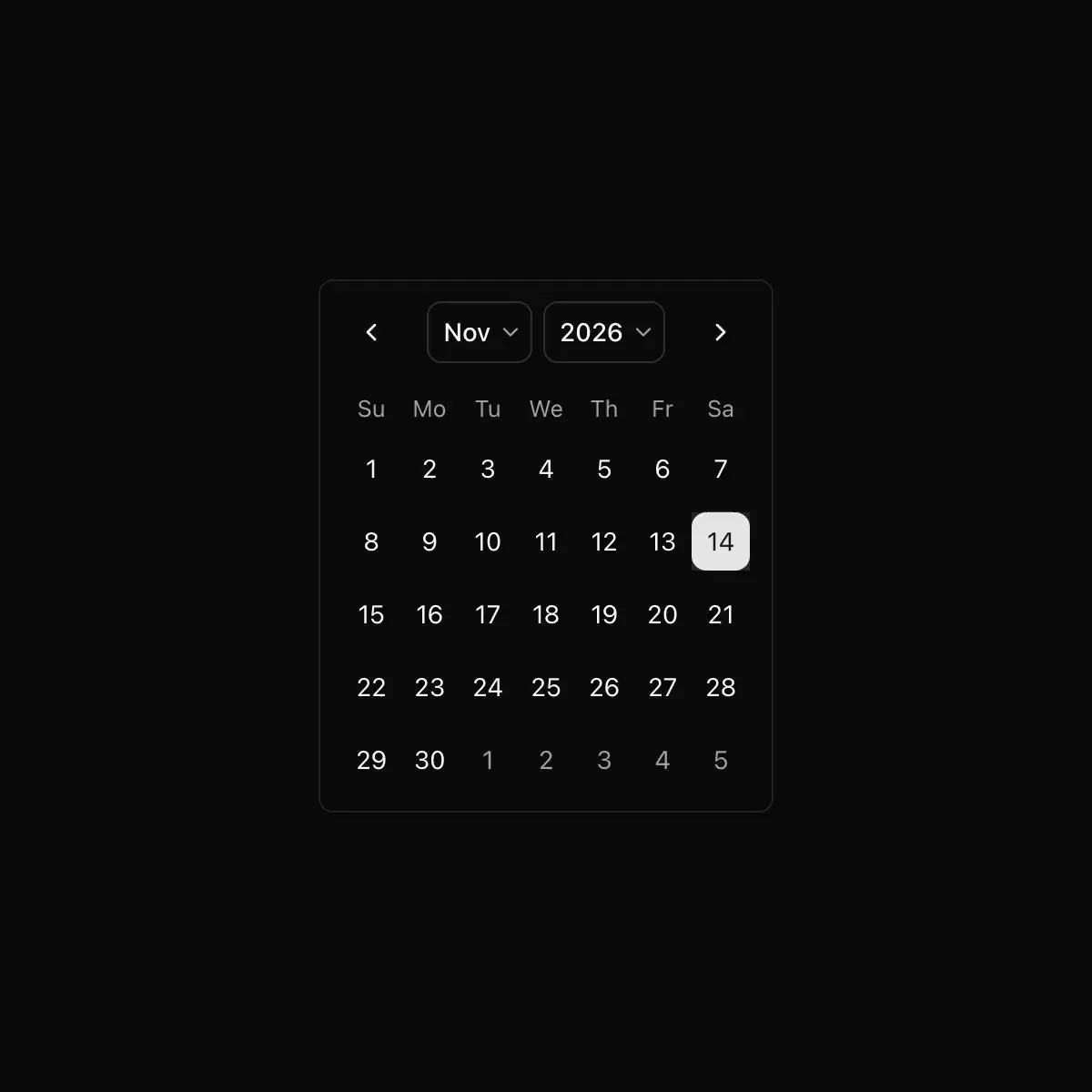 calendar from shadcn
A month grid for choosing a day or a range, usable on its own or inside a picker.
Showing 4,153–4,176 of 29,980
Showing 4,153–4,176 of 29,980