Card surface with 4 variants (outline, elevated, soft, glass) and 3 inset scales (sm, md, lg) that pad header, content and footer together. Parts: Card, CardHeader, CardTitle, CardDescription, CardAction, CardContent, CardFooter.
2 registry deps · 1 package
Container for grouping related content and actions.
A flexible container for grouping related content and actions.
Elevated surface with header, content, and footer slots.
LayoutSolid · 1 registry dep · 1 package
A card component for containing content.
Displays a card with header, content, and footer.
Displays a card with header, content, and footer.
A container for grouping related content and actions.
Displays a card with header, content, and footer with thick borders and shadows
Peach card with brick header and body.
Layout2 registry deps · 1 package
A weighted panel with stronger elevation than controls.
A titled container with media, status, meta and optional expandable details.
Navigation1 registry dep · 5 packages
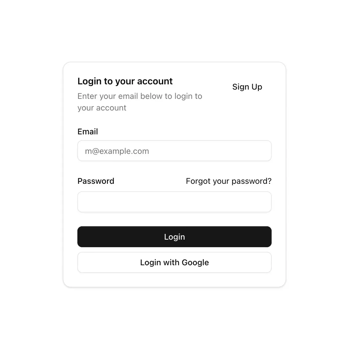
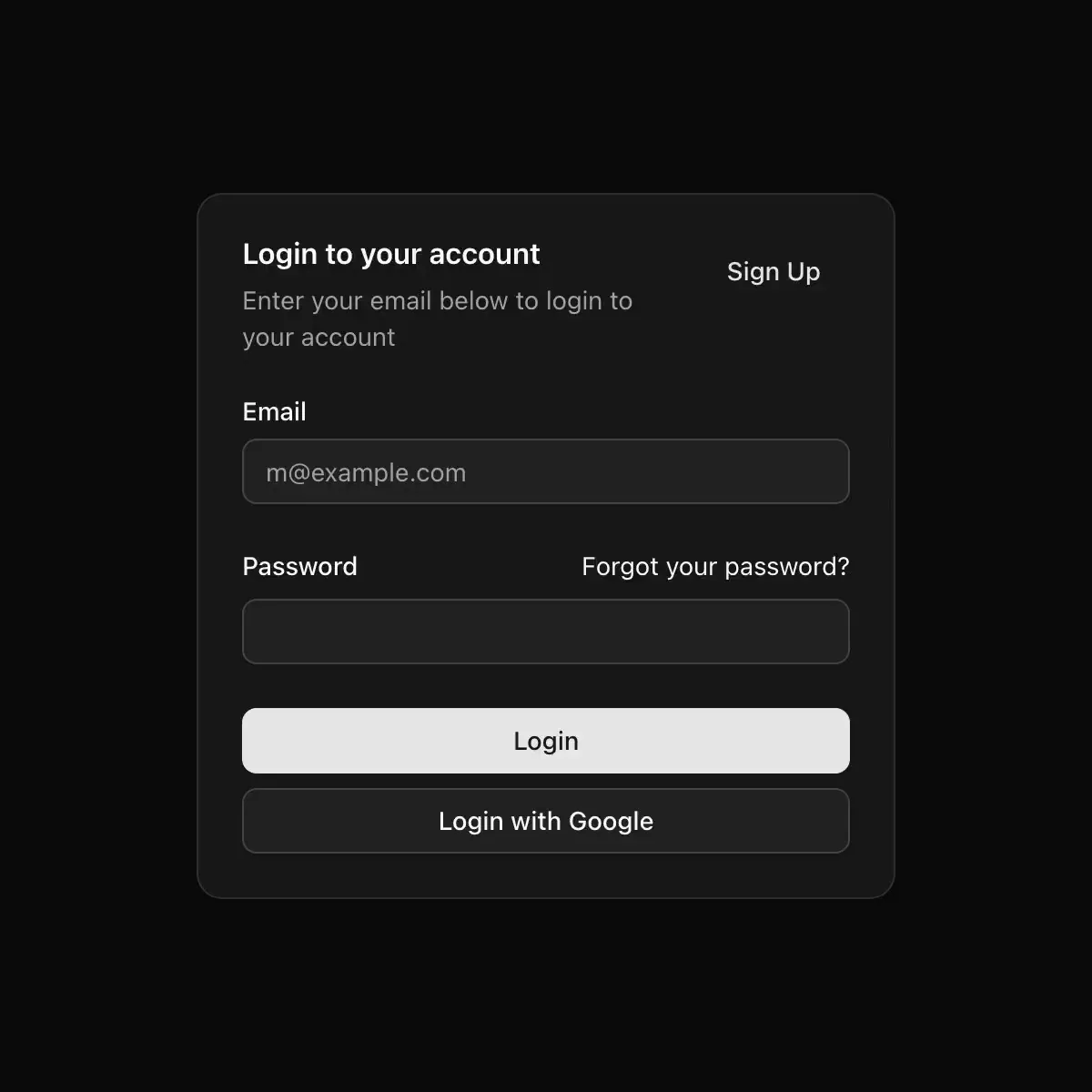 card from shadcn
A bordered surface that groups related content, with a header, content and footer.
Layout1 registry dep · 2 packages
CoreCN Card primitive built on shadcn/ui.
Container with header, title, description, action, content and footer parts.
A glass tile for grouping related content.
Data display1 registry dep
A card component.
Layout1 registry dep · 1 package
Surfaces with crop marks, raised and inset styles, and a divided footer tray.
3 registry deps · 2 packages
A macOS box: a rounded panel with a hairline edge, a header, content and a footer.
Displays a card with header, content, and footer.