@blode
A control that allows the user to toggle between checked and unchecked states.
Forms1 package
A control that allows the user to toggle between checked and unchecked states.
A control that allows the user to toggle between checked and not checked
28px sunken box, orange when checked.
An accessible checkbox with clear checked and disabled states.
Checkbox, checkbox-group, and tristate checkbox field for BuzzForm v2.
A native checkbox with a clear checked, unchecked and indeterminate state.
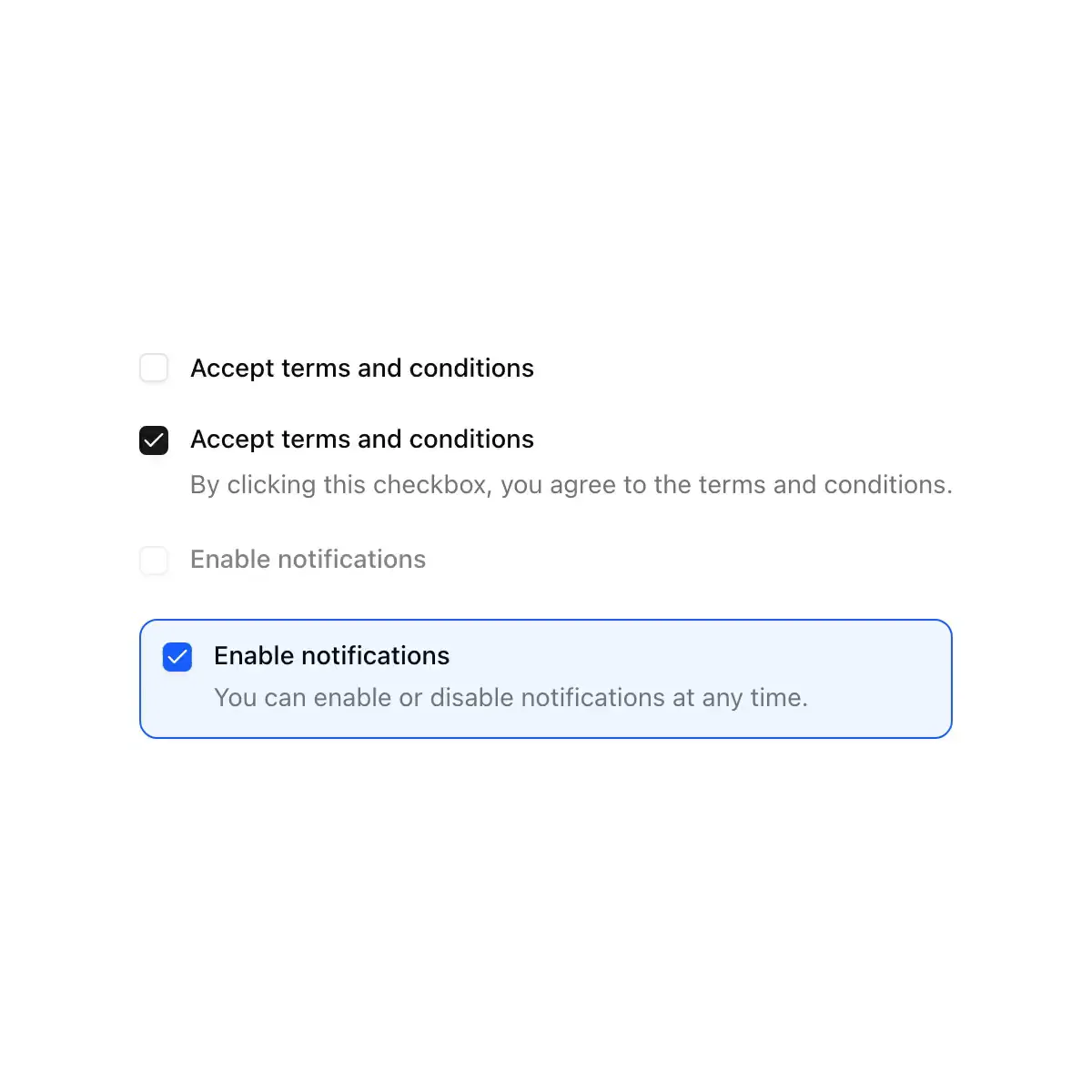
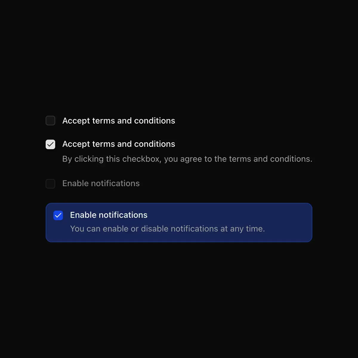 checkbox from shadcn
A checkbox that draws its check mark and squishes when pressed.
A small square that fills with the accent when checked.
CoreCN Checkbox primitive built on shadcn/ui.
Checkbox with checked, unchecked and indeterminate states.
A native checkbox with its label.
A checkbox component.
Checkboxes with a self-drawing check mark and an indeterminate state.
A 16pt rounded checkbox that fills with the accent color, with mixed state support.
A control that allows the user to toggle between checked and not checked.
A control that toggles between checked and unchecked.
Animated checkbox for React and shadcn: the check draws itself and morphs into a dash for indeterminate parent checkboxes.
A box ticked in pen, with an animated stroke.
Showing 5,473–5,496 of 30,790
Showing 5,473–5,496 of 30,790