


















@mewo
A fanned rail of album sleeves that turn away in 3D, with a record that slides out and spins on play, a tick ruler, swipe, wheel and arrow keys. No dependencies.
Layout
A fanned rail of album sleeves that turn away in 3D, with a record that slides out and spins on play, a tick ruler, swipe, wheel and arrow keys. No dependencies.
An authored note, attached-action banner or folded dispatch that makes the message and its next step clear.
Alert example: an inline status callout with title, description and an optional top-right action. Default and destructive variants; a leading icon moves the text into a second column.
A double bar: in a score, the sign that something changes here.
A notice with a lit left edge and a matching icon. Four tones.
Alert with a variant x tone matrix: 2 variants (soft, outline) x 6 tones. Optional leading icon, AlertTitle and AlertDescription. role=alert.
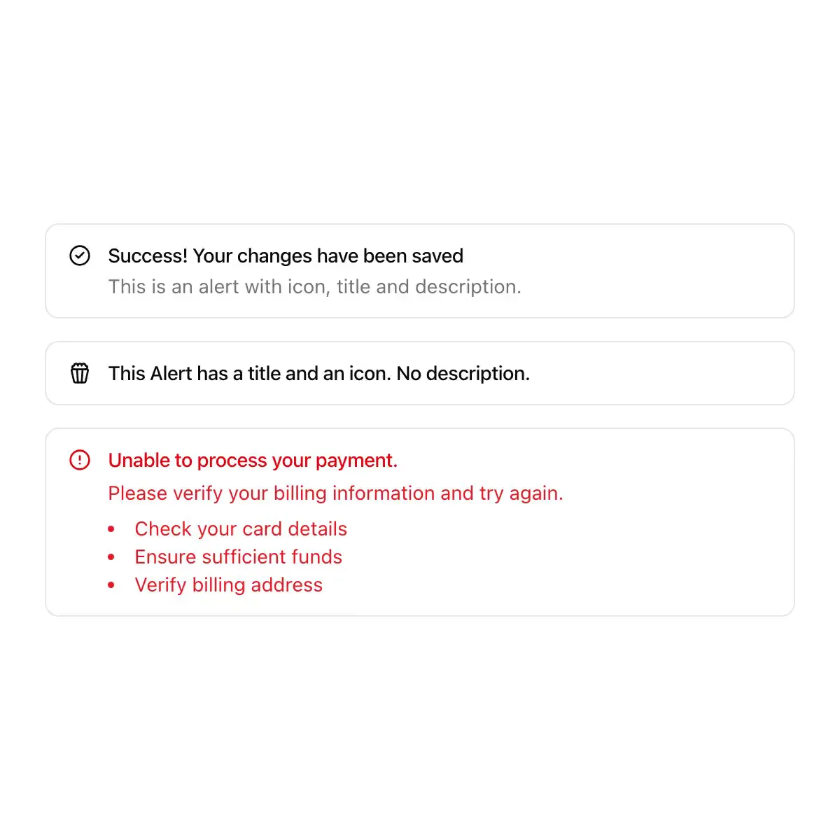
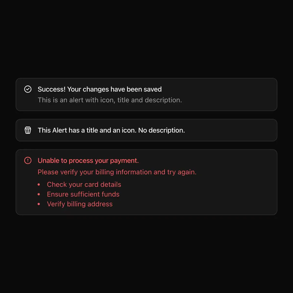 alert from shadcn
A shadcn-style alert component built with Ark UI primitives.
Displays a callout for user attention.
A callout that displays a short, important message to attract attention.
Displays a callout for user attention with bold neubrutalism borders
A structured alert that never relies on color alone.
An inline message that keeps context and recovery beside the work.
A callout with an icon, a title, a description and an action, its status on the icon.
CoreCN Alert primitive built on shadcn/ui.
Callout for important messages on a neutral surface; default, success, warning and destructive tones colour the icon.
A message in the page: what happened and what to do.
A alert component.
Callouts with a colored rail, tone icons and fold-away dismiss.
An inline callout in a pane: a tinted box with a symbol, a title and a description.
Displays a callout for user attention.
Showing 577–600 of 26,785
Showing 577–600 of 26,785