Celebration confetti: seeded chips and streamers fall under gravity with per-piece spin, tumble (foreshortening flip with a shadowed backface) and flutter. Opens with an upward burst on mount and keeps firing occasional puffs, then settles into a gentle endless drift. Festive-but-tasteful density, colors/speed/count knobs. Canvas 2D, seeded, offscreen-paused, reduced-motion-safe (static settled scatter).
Hand-drawn confetti icon that draws itself in and wiggles. MIT licensed.
Confetti celebration effect powered by canvas-confetti with button trigger support
Motion and effects3 registry deps · 1 package

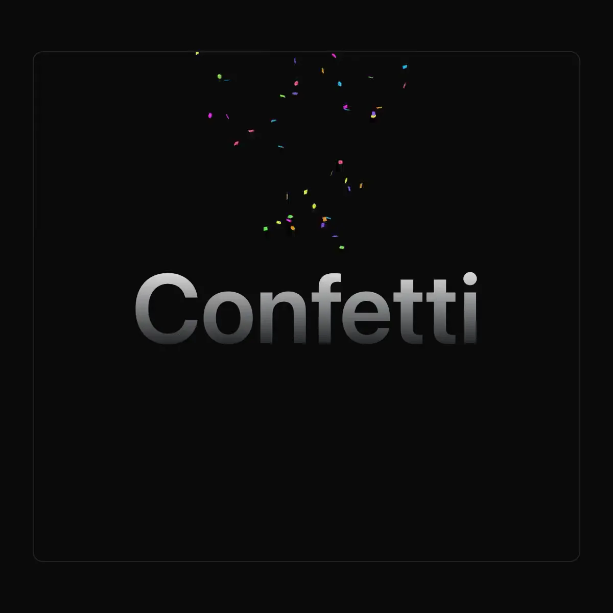 Confetti from @magicui
Dependency-free confetti burst, fired from anywhere.
Falling confetti in your theme colors.
An answer that says how sure it is — a warning badge only when there is something to warn about, and a hedge that names what to verify.
Hand-hatched underlines under low-confidence tokens, stroke density mapping straight to logprob doubt in three buckets, with a hover/focus popover naming what the model almost said instead.
How sure the agent is: a range in words with reasons, never a percentage.
Animated configuration icon for Vue
Animated configuration icon for Vue
Animated configuration icon for Vue

Inline two-step confirmation on the button itself, with no modal and no dialog state to wire up: the first click arms it — the label swaps to "Confirm?" and the button turns destructive — and only the second click calls onConfirm. It disarms itself after a timeout (3s by default) and on blur, so a stray double-click, a scroll away, a Tab out or a click somewhere else can never fire the action; that pair of escapes is the whole difference between this and the naive version, which is armed forever and goes off the next time the row is clicked for any reason at all. Reach for it wherever a modal would outweigh the action, which is almost every destructive control that lives inside a list rather than on a page: a delete, remove, archive or discard button in a table row, a card, a kanban card, a list item, a file or media row, a comment or post, a cart line, an uploaded attachment, a saved filter or view, a tag or label, or a toolbar; removing a member, collaborator, invite or seat; revoking an API key, token, session or device; deleting a webhook, cron job, alert rule or integration; disconnecting an OAuth app; clearing a cache, a log or a draft; unsubscribing; leaving a channel or workspace; resetting one setting back to its default. Common asks it answers: "confirm before delete without a dialog", "two-step delete button react", "click twice to confirm", "double click to delete", "are you sure button shadcn", "shadcn confirm button", "inline confirmation button", "confirm action without modal", "destructive button with confirmation", "delete button in a table row", "delete confirmation table row react", "undo-less delete confirmation", "replace window.confirm react", "react-confirm-alert alternative", "sweetalert alternative shadcn", "useConfirm hook alternative". Props: `onConfirm` (fired only on the confirming click), `confirmText` for the armed label, `timeout` in milliseconds, plus everything else a `<button>` takes. It is one real `<button>` element — Enter and Space confirm it, `disabled` is honoured, your `className` is merged through `cn`, and it defaults to `type="button"` so an armed click inside a form cannot submit it by accident. The armed state is exposed as `data-armed` for styling and announced through a permanently mounted polite live region, so the change is never carried by colour and a label swap alone — which is exactly what a screen reader would otherwise miss, since nothing about the second click announces itself. Theme-aware through the destructive tokens, zero dependencies (no Radix, no portal, no icon package, one file), and `"use client"` because it holds a state and a timer. What official shadcn/ui offers instead is alert-dialog: a modal that pulls in @radix-ui/react-alert-dialog, renders through a portal, traps focus and needs open state wired up — right for a page-level, consequential confirmation, and far too heavy to put on all twenty rows of a table. Official button has a destructive variant but no confirmation behaviour at all, and official alert is a static message. For an action severe enough that a second click is not enough — deleting a production project, a database or an account — use type-to-confirm, which makes the user type the name first. Composes with loading-button when the confirmed action is slow, and sits naturally next to bulk-action-bar, which confirms the same way for a whole selection rather than one row.
A Button that confirms on a click, a second click or a press and hold. Supports inline undo and a pending state for an async onConfirm.
Buttons and actions1 registry dep
Tap-again-to-confirm button for a destructive or disruptive action, with the armed state announced to assistive tech.
Buttons and actions3 registry deps
Destructive action confirm: a red trigger button opens a dialog with a title, warning text, Cancel and Confirm. Labels are configurable for deletes and resets.
Destructive-action confirm gated on precision, not patience: rotate an SVG dial's notch to within 3deg of a fixed index, hold it there 400ms, and the dial snaps home and arms the confirm button. Overshoot and it springs back like a slipping safe tumbler.
Confirm Dialog from the Get IT Done design system.
Asks the user to confirm an action, with Cancel focused first.
An alert dialog with a ConfirmButton or TypeToConfirm as its confirm action, which closes only after an async onConfirm settles. Includes useConfirm, which returns an awaitable confirm() and a dialog element you render yourself.
Press-and-hold destructive action: monochrome ink pours up from the press point, release early and it recoils.
Press-and-hold confirm as a molten wax seal: holding pours a wobbling gooey blob of deep crimson wax onto the document line, hold-complete drops a signet stamp that squashes it into a scalloped, monogrammed seal that cools, darkens and micro-cracks over 2s, while early release slumps the blob and drains it back.
A DropdownMenu or ContextMenu item that confirms on a click, a second click or a press and hold. The menu stays open while the item is armed, held, pending or showing Undo, and closes once the action commits.
Navigation2 registry deps
A destructive button that morphs into an inline confirmation, a spinner, and a result with undo.
1 registry dep · 2 packages