@brut-ui
A strongly elevated modal that preserves Base UI focus and keyboard behavior.
Overlays1 registry dep · 3 packages
A strongly elevated modal that preserves Base UI focus and keyboard behavior.
A modal window that asks for a decision or a short form, with focus kept inside.
A dialog that springs up over a light overlay and animates out before it closes.
A centered surface over a dimmed page, for a decision that needs full attention.
CoreCN Dialog primitive built on shadcn/ui.
Modal window centred over the page, with a focus trap, overlay, close button, header, footer, title and description parts.
A question over a dimmed page. It traps focus and returns it when closed.
A dialog component.
Modal dialogs with crop marks, an Esc hint and a footer tray.
A modal panel window with a close button in the traffic light position.
A window overlaid on either the primary window or another dialog window, rendering the content underneath inert.
A modal window that focuses the user on a single task.
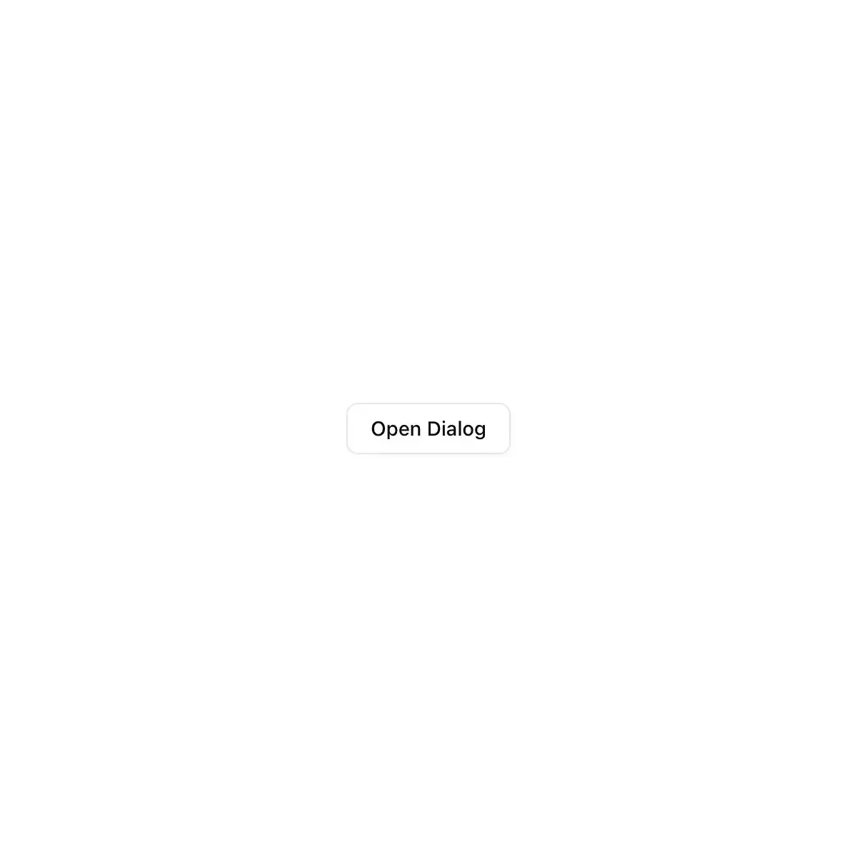
 dialog from shadcn
Modal dialog for React and shadcn, with confirm (alert) dialogs and nested dialogs, built on Base UI.
A letter that slides up out of its envelope.
An accessible modal dialog built on Base UI.
A modal panel with a title, description, body and free-form footer — portals out, traps focus, and locks the page's scroll while open
An accessible React dialog for Next.js and Tailwind CSS: a modal window that grows out of its trigger, keeps focus inside and returns it, built on Radix Dialog.
A window over the page for a short task, such as editing a few fields, that keeps focus until it's done or dismissed.
Showing 8,713–8,736 of 30,794
Showing 8,713–8,736 of 30,794