@exabase
Forms2 registry deps
A label, description and error wired to one form control, with a group that sets the size of a whole form.
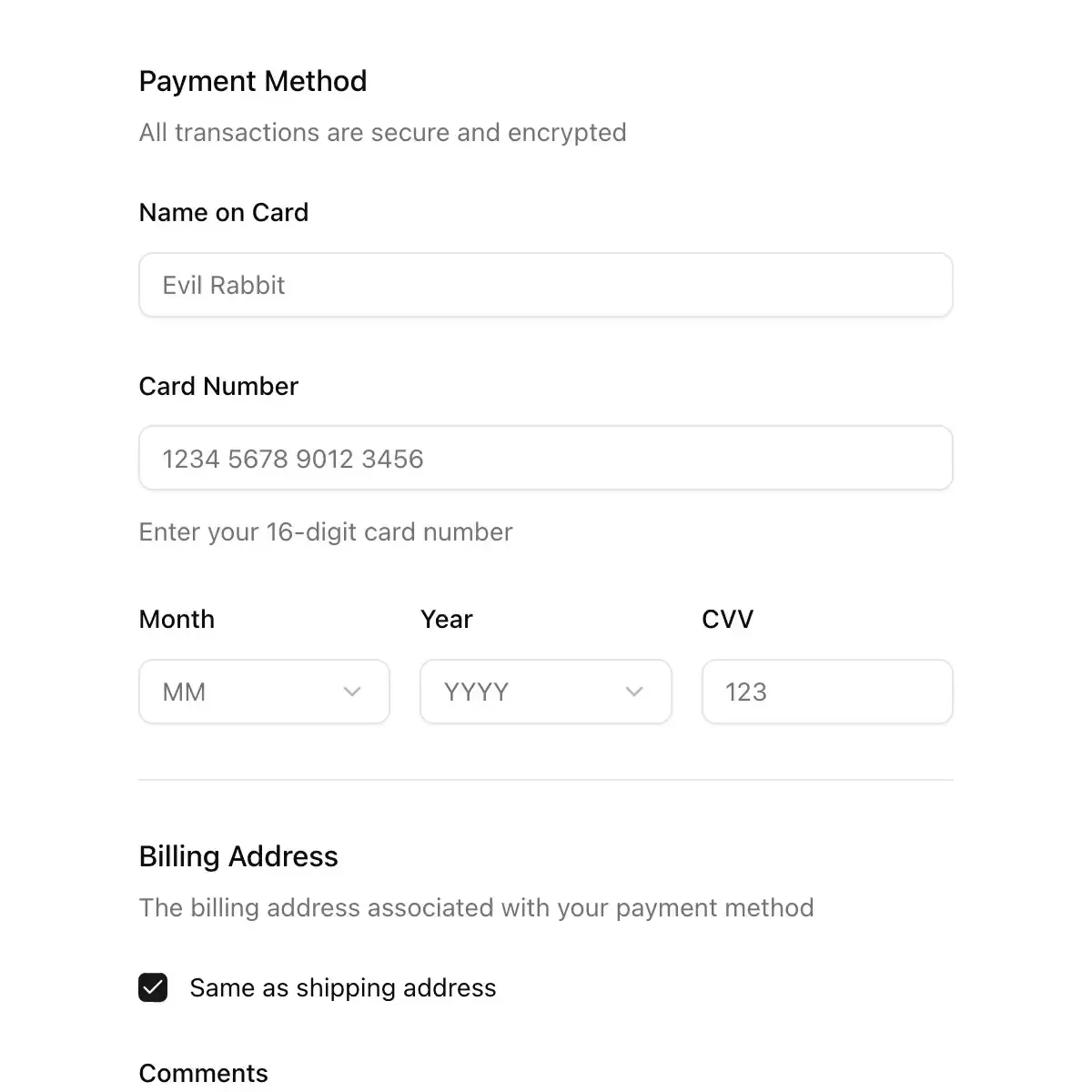
 field from shadcn
Compose a label, a control, helper text, and a validation message into one accessible field: fieldsets, legends, groups, separators, and vertical, horizontal, or responsive layouts.
Field components for TanStack Form (Field, FieldLabel, FieldError, FieldDescription)
Shared form field coordinator for label, hint, marker-flagged error alert, required indicator, density, and aria-describedby/aria-invalid context.
Label, control and hint line with ids wired for screen readers; errors shake the control once and blur in under it.
Labels, descriptions and errors wired to their control, with validation states and layouts for forms.
An accessible form field with automatic labels, descriptions, validation state, and error messages.
A form control with its label, hint and error, wired together for screen readers.
Form structure: label, description, error and grouping for any input control.
field
قالب مشترک برچسب + کنترل + راهنما/خطا
Field, input, affix cells, field group and validation with an inserted attention cell. Form (Base UI Form) and vertical, horizontal or responsive field orientation.
A form field wrapper with label, description, error messages, and horizontal/vertical orientation variants.
Glass text inputs, fields, fieldsets and forms.
A component that provides labeling and validation for form controls.
The label, description, and error scaffolding shared by every form control.
Gives any control a label, description, error and required mark, and wires the ids and aria attributes so nobody has to remember them.
Showing 10,633–10,656 of 30,794
Showing 10,633–10,656 of 30,794