Card installment choices with amounts, interest terms, and totals in list, tiles, and compact variants.
Forms3 registry deps · 1 package
Card installment choices with amounts, interest terms, and totals in list, tiles, and compact variants.
An app integration tile with the service name, a short description, a Connected or Available badge and a Connect or Manage button. Built in React.
Explains system relationships through nodes, routed links, and moving signals.
A hub and the tools wired into it, with pulses along the routes.
An integrations component.
Your app in the middle and four services around it, joined by routes with small ports. An event comes in along one route, the app lights up, and the answer goes out along the others. Put your own marks on the tiles.
A slow light around the screen edge while the assistant listens or thinks, visible from anywhere on the page.
A React SVG area chart with a crosshair that follows the pointer or arrow keys, showing the value and percent change against a dashed comparison line.
The whole card is one link, while buttons inside still get their own clicks.
A scattered stack of photo cards. Drag, click, or arrow keys to focus any card. Free account required to install; source is free to read.
A tactile floating contact button that expands into an interactive profile card.
A grid whose cells light up under the pointer and fade out behind it.
A full-page field of square cells that locally soften and round around a fine pointer.
SVG grid of squares that highlight on hover with smooth fade transitions

 Interactive Grid Pattern from @magicui
Button whose dot opens into a circle that fills it on hover, while the label rolls up and out and returns with an arrow
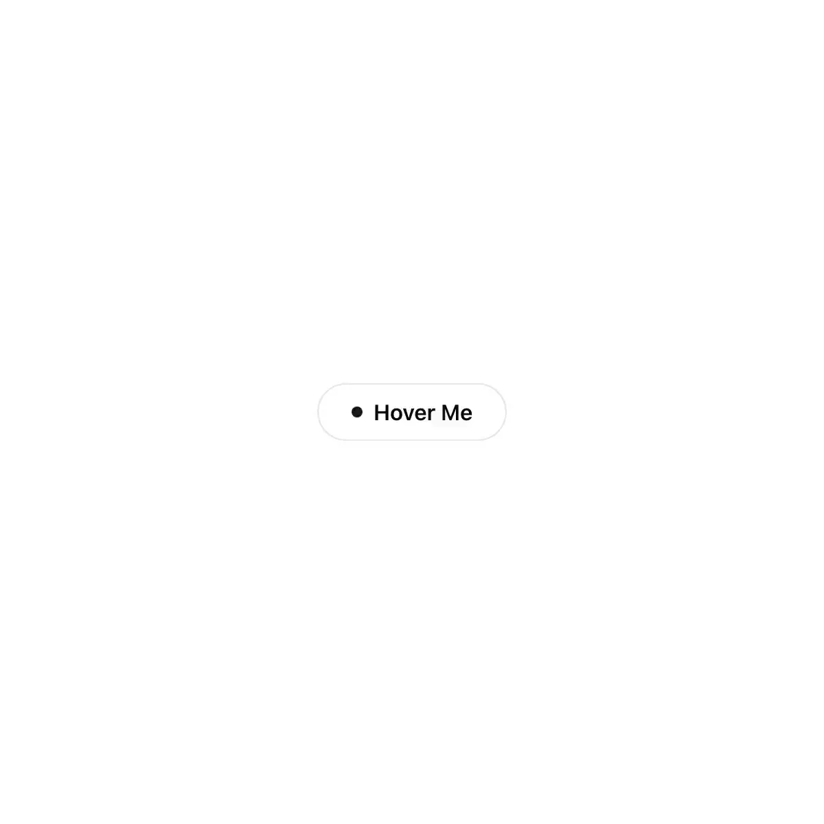
 interactive-hover-button from @magicui
A InteractiveImageSelector component for SmoothUI.
A text field with a floating label, a focus ring that blooms out of the border, a spring-in clear button, a character-count ring and a shake on error.
Showing 15,697–15,720 of 30,794
Showing 15,697–15,720 of 30,794