@iconaut
Iconaut italic icon, duotone, with native fits at 16/20/24px. MIT.
Icons
Iconaut italic icon, duotone, with native fits at 16/20/24px. MIT.
Iconaut italic icon, solid, with native fits at 16/20/24px. MIT.
A notebook ledger, an illustrated collection or an actionable detail. Three readable arrangements for the things you want to keep together.
Item example: a flexible list row with media, content, title, description, actions, header and footer parts. Default, outline and muted variants in three densities; can render as a link.
A ledger line: what it is, a dotted leader, what you can do. Point at it and the leader inks across. Or every fifth line numbered in the margin; or the description running along the leader.
List/row primitive with 3 variants (default, outline, muted) and 2 sizes (default, sm). Parts: Item, ItemGroup, ItemMedia (default/icon/image), ItemContent, ItemTitle, ItemDescription, ItemActions, ItemHeader, ItemFooter, ItemSeparator. asChild renders the row as a link.
Composable list item with media, content, title, description, and action slots.
A versatile component that you can use to display any content.
A flexible list item component for menus, settings, and data rows.
Media plus title, description, actions.
The BRUT/UI Item component with the current shadcn behavior and API.
A row with media, a title, a description and actions, alone or in a list.
CoreCN Item primitive built on shadcn/ui.
A flexible row: media, title, description and actions.
A row of a list: an icon or picture, a title and description, and actions at the end.
A versatile component to display any content: media, title, description and actions.
A row of media, text and actions for lists, settings and pickers, with a grouped surface and a hover highlight that glides between rows.
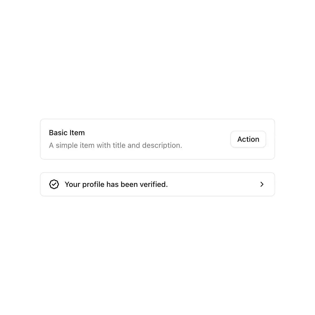
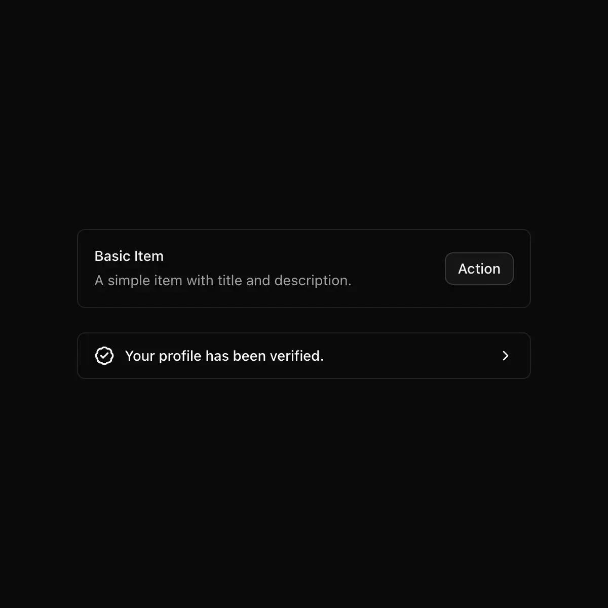 item from shadcn
Showing 15,817–15,840 of 30,794
Showing 15,817–15,840 of 30,794