@herocn
Forms
A label that follows its control, dimming when it's disabled and marking it required or optional on its own.
Animated label icon for Vue
An accessible label for form controls.
A form label that pairs with Input, Select and the other controls, with a required marker.
Accessible text label for form controls.
Accessible caption for a form control. Built on Radix Label.
The visible text that names a form control, with an optional required mark that screen readers announce too.
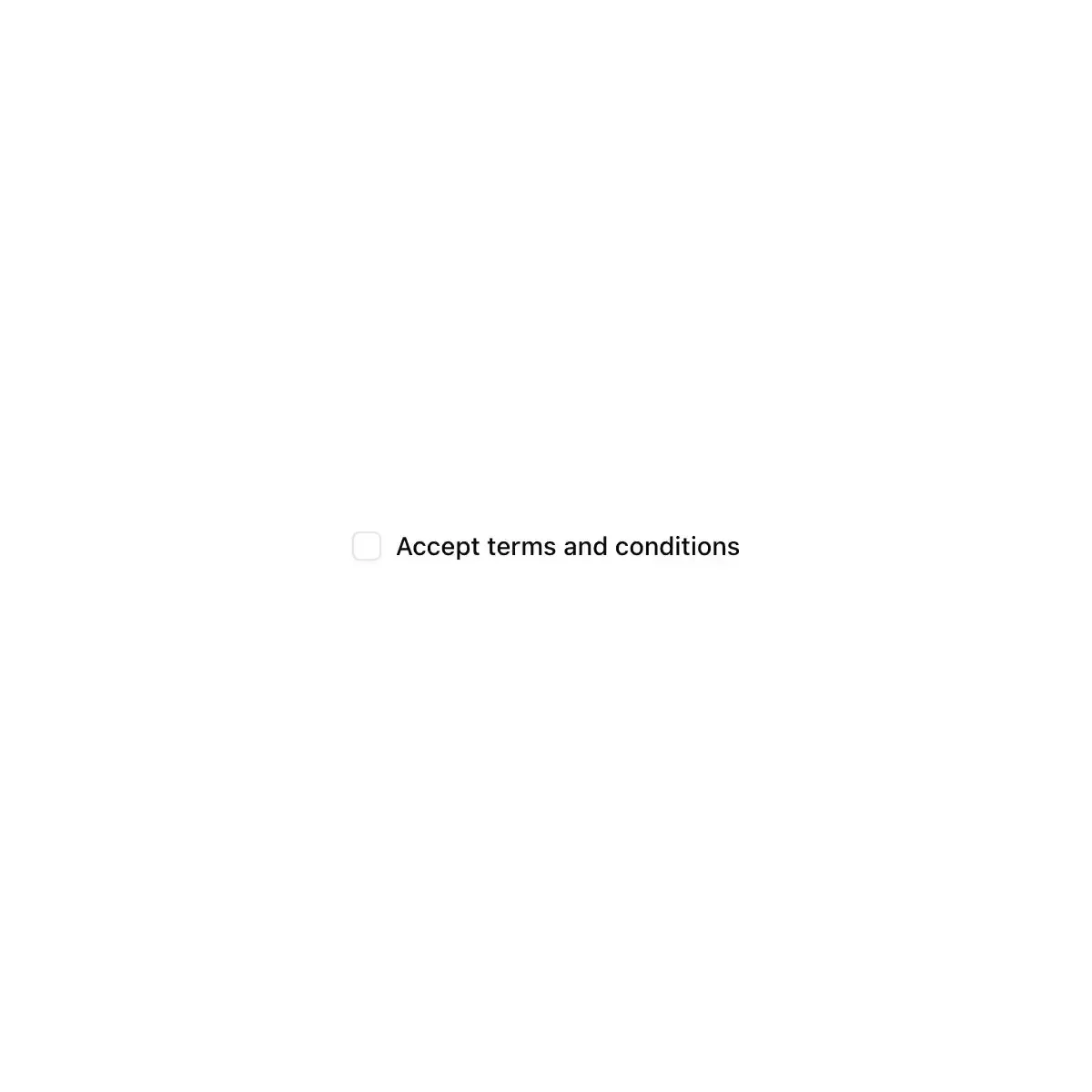
 label from shadcn
A form label element built on Radix UI Label primitive.
Renders an accessible label associated with controls.
A form label bound to its control.
A form label that dims and blocks pointer events when its peer input or group is disabled. Native label API, styled with Tailwind like the shadcn label.
Caption bound to a control: clicking it focuses the field, and it dims when the field is disabled.
The label of a control.
An accessible text label for a form control.
Form label primitive.
An accessible form label with disabled-state styling.
An accessible, styled label element.
Accessible label for a form control, built on Radix.
An accessible label primitive.
Showing 16,225–16,248 of 30,794
Showing 16,225–16,248 of 30,794