@forgeui
Animated onboarding progress card showing three steps with visual loaders, transitions, and completion indicators.
Feedback
Animated onboarding progress card showing three steps with visual loaders, transitions, and completion indicators.
Progress Striped Primary variant for component.
Progress, elapsed time, remaining work, and cancellation in one composable summary.
Live telegraph feed for multi-stage operations of unknowable total duration: each real sub-step arrives as its own line with a ticking elapsed timer, then collapses into a dense done-ledger with its true cost frozen. Stalls are self-evident because the active timer keeps counting while nothing new arrives.
Onboarding checklist with an animated progress bar, ticks that draw themselves and auto play
Onboarding checklist with an animated progress bar, ticks that draw themselves and auto play
A determinate progress bar that advances by capillary action (quick pull, slowing soak, brief dwell, next pull), with a faint wet-front runner previewing the track a few pixels ahead of the true fill, so bursty real-world progress (chunked uploads) reads as natural rather than janky.
Progress With Steps variant for component.
Progress With Value variant for component.
Layered backdrop-blur overlay that progressively fades content at container edges
Progressive blur for React and shadcn: a backdrop blur that ramps up to 20px toward an edge, under sticky headers, bottom bars and composers.
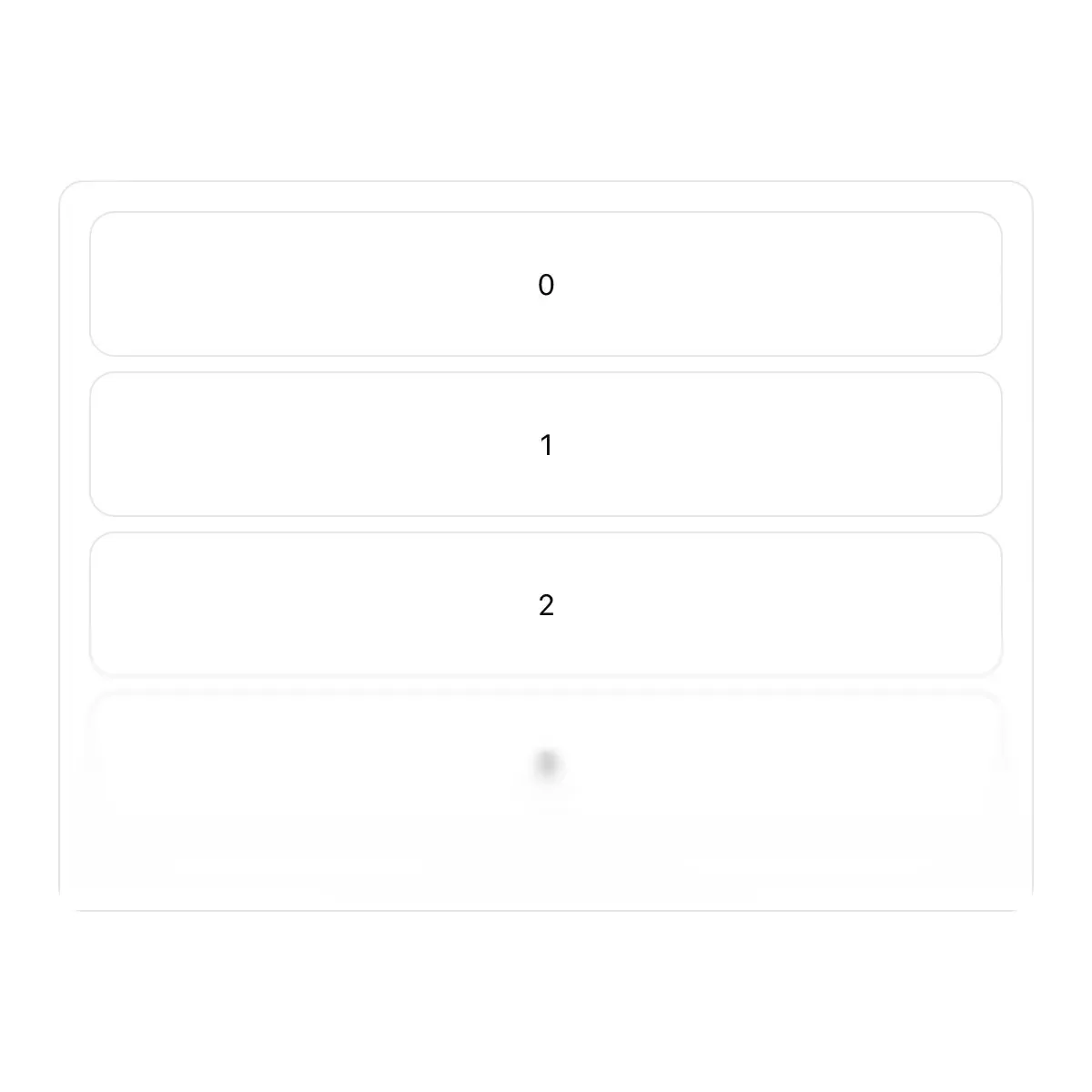
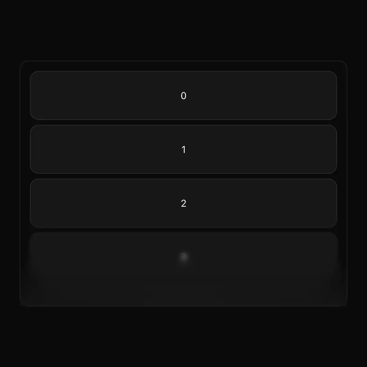 Progressive Blur from @magicui
A blur that gets stronger towards an edge, and a scroll area that wears one at each end: the ends blur and dissolve only while there is more to scroll that way. CSS only, on any background.
A component that applies progressive blur effects to elements.
A ProgressiveBlur component for SmoothUI.
A stacked-layer blur that ramps smoothly from sharp to fully blurred toward an edge, for fading content under a fixed header or above a scroll boundary.
Top and bottom progressive blur overlays that stack multiple backdrop-filter layers to produce a smooth edge-to-transparent blur effect.
A project-wide notice with one action.
Shared cutout project card with blurred-gradient media and a liquid-metal hover ring.
An IDE-style project showcase with collapsible year folders, status badges, and floating cursor image hover previews.
A list of companies or projects where each row shows its cover beside the cursor on hover, for fund portfolios and case study pages.
A CSS-powered primitive that layers an element with projected and contact shadows, supports an animation opt-out, and gathers on hover or active state.
Animated projector icon for Vue
Iconaut projector icon, line, with native fits at 16/20/24px. MIT.
Showing 21,961–21,984 of 29,980
Showing 21,961–21,984 of 29,980