@whiskeyjack
Read-only auto-hiding scroll thumb for scrollers whose native scrollbar would run behind floating chrome.
Data display2 registry deps
Read-only auto-hiding scroll thumb for scrollers whose native scrollbar would run behind floating chrome.
Scroll opens a mask that reveals an image six ways: iris, wipe, curtain, slats, grid or a word. No dependencies.
Expands contained media into an immersive hero through chapter scrolling.
A softly stretching companion driven by native document scrolling.
Scroll scrubs a camera through a monochrome point tunnel: velocity stretches dots into motion streaks, cursor drift adds parallax, and mono section labels at fixed depths snap into focus as you fly past.
Scroll flies the camera through nested frames, each opening onto the next scene. No dependencies.
Reading-progress bar driven by scroll position.
A bar that fills as you scroll the page or a panel.
A spring-animated progress bar that tracks page or container scroll position
A reading progress bar that fills as the page scrolls, with CSS scroll-driven animations and no JavaScript.
Reading progress bar scrubbed to scroll.
Thin reading-progress bar that fills as the page — or a target element — scrolls, driven by a zero-JS CSS scroll-timeline where supported and a throttled scroll listener everywhere else, with an optional accessible progressbar label
Ruler-style scroll indicator with tick marks that fill in as the page scrolls and a live percentage readout, dockable to either side or bottom corner of the viewport or a scrollable container.
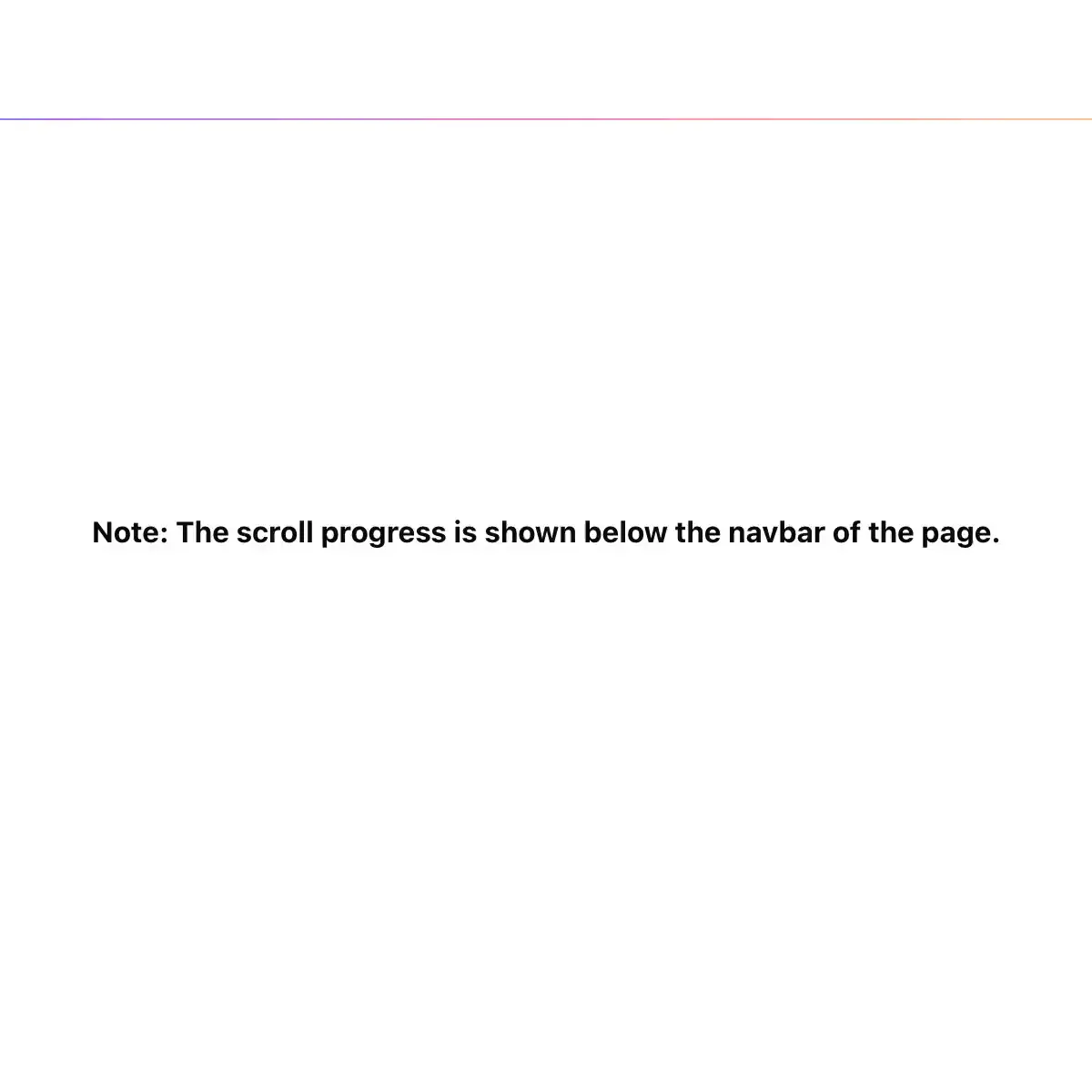
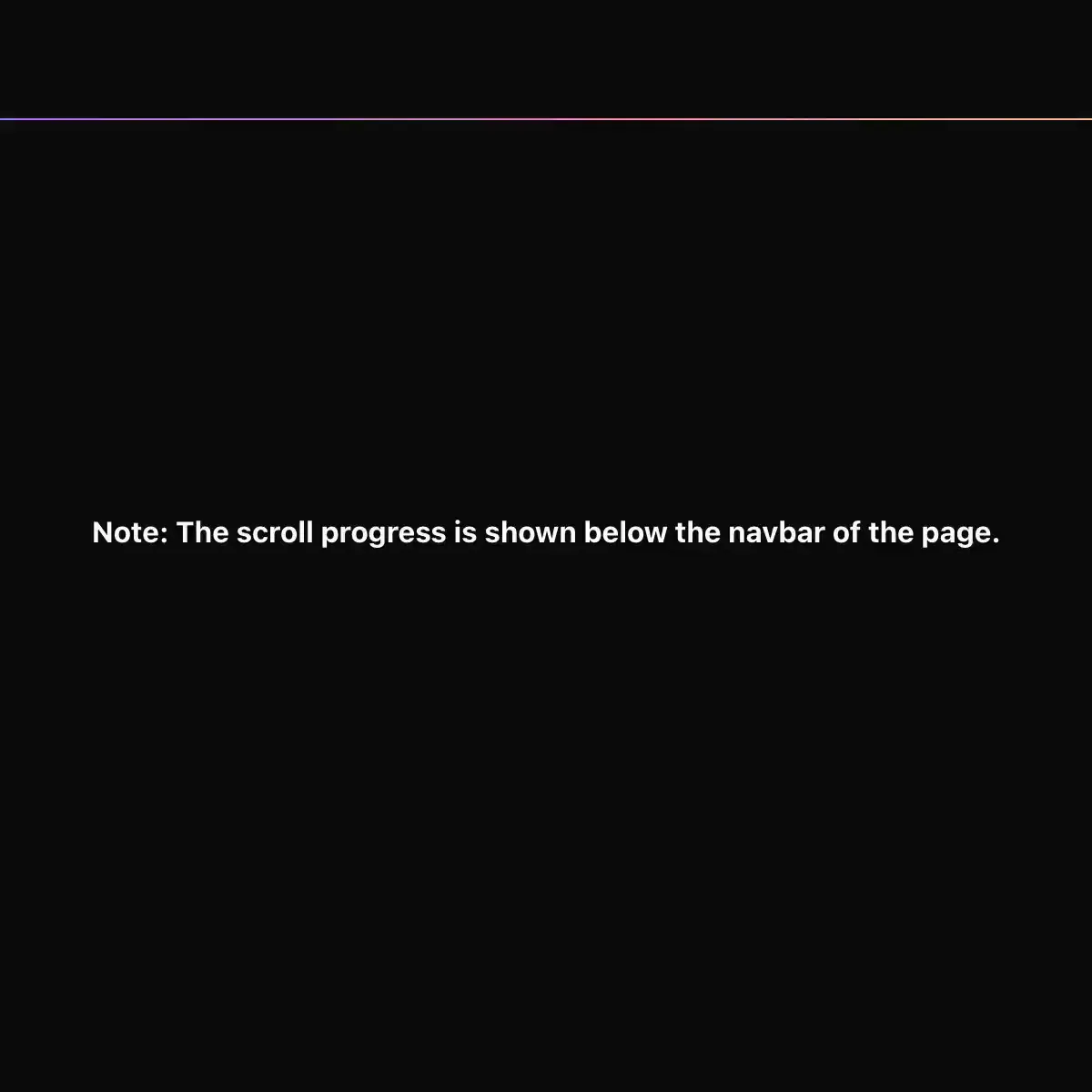 Scroll Progress from @magicui
A component that visualizes scroll progress with animated indicators.
A bar that fills as the reader scrolls — the reading indicator across the top of an article, and the "how much is left?" cue on anything long. Use it on blog posts and long-form articles, documentation pages, guides and tutorials, changelogs and release notes, terms / privacy / policy pages, onboarding and multi-section landing pages, reports, and long forms or checkout flows where the reader wants to know how much further there is to go. Common asks it answers: "reading progress bar", "scroll progress bar react", "scroll indicator component", "article reading progress", "page scroll percentage", "Medium-style progress bar", "progress bar at top of page on scroll", "how far down the page has the user scrolled", "scroll-linked progress indicator", "blog reading indicator", "useScrollProgress hook", "track scroll position in React". Drop in `<ScrollProgress className="fixed inset-x-0 top-0 z-50" />` for the classic placement, or render it as an ordinary block under a sticky header. Pass `target={articleRef}` when progress should mean "through this article" rather than "down this page" — on a page that continues into related posts, a comment thread or a tall footer, a whole-page bar is still short of the end when the article has actually been read, and a tracked element fills exactly as the last line arrives. `indicatorClassName` styles the filled part; the track and fill use your `--muted` and `--primary` tokens, so both themes follow automatically with no hardcoded colours. It settles the details a hand-rolled version gets wrong. Measurement is throttled to one requestAnimationFrame per scroll burst and quantised before it reaches state, so a flick that moves the bar by less than a fifth of a pixel re-renders nothing. Content that grows after first paint — an image finishing decoding, a lazily loaded section, an accordion opening, a web font swapping in — is picked up through a ResizeObserver and `document.fonts.ready`, where a scroll-and-resize-only implementation keeps reporting the old page height. A tracked element inside an app shell that scrolls its own `<main>` instead of the window is measured against that scroller, not the viewport, which is the layout where a naive bar sits frozen. When the content already fits on screen the bar reads full rather than empty, because everything there is to read is visible — the usual choice of 0 leaves a permanently empty bar on every short page, which looks broken rather than finished. The first paint is server-safe: it renders an empty bar on the server and takes its real measurement in a layout effect before the browser paints, so there is no hydration mismatch and no visible jump on a page restored mid-scroll. Decorative by design — the scrollbar already tells assistive technology where the reader is, and a `role="progressbar"` updating every frame of a scroll is announced as a stream of numbers over whatever is being read, so the element is `aria-hidden` instead of noisy. `useScrollProgress` is exported for indicators this component does not draw (a percentage in the header, a circular ring, chapter markers) so they share one number instead of a second implementation that disagrees at the edges. No dependencies beyond React. Official shadcn/ui has nothing scroll-aware: its progress is a Radix bar you drive with a value you already have, not one derived from the reader's position.
A reading-progress indicator with bar, ring, number and segmented variants.
A thin bar that shows how far down the page the reader is.
Gradient page-progress bar pinned to the top.
A floating ring that shows how far a page has been read and turns into a back-to-top button at the end.
A quiet document minimap with equal short dashes that expand near the pointer and follow the active content block.
Native scroll progress resolves word opacity and blur while leveling the phrase.
Elements animate into view when they enter the viewport, with any Motion variant
Reveals children once as they scroll in, with a capped stagger that never replays.
Showing 23,641–23,664 of 29,980
Showing 23,641–23,664 of 29,980